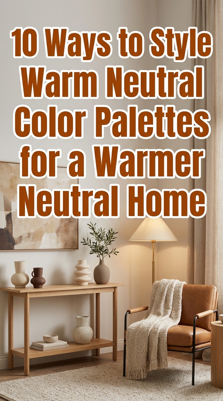
10 Ways to Style Warm Neutral Color Palettes for a Warmer Neutral Home
If your “neutral” home still feels a little cold, it’s usually not the paint—it’s the styling. Warm neutral color palettes can instantly make your space feel cozier, more lived-in, and more elevated, without going full beige overload. In this guide, you’ll learn 10 ways to layer warm creams, caramel, cocoa, and espresso tones using textures, lighting, and intentional accents. Think boucle softness, earthy ceramics, tonal rugs, and art that warms up the whole room. Let’s make your neutral home feel like golden hour—starting with the easiest swaps you can do today.
1. Start with a buttery base layer (cream + oatmeal + tan)
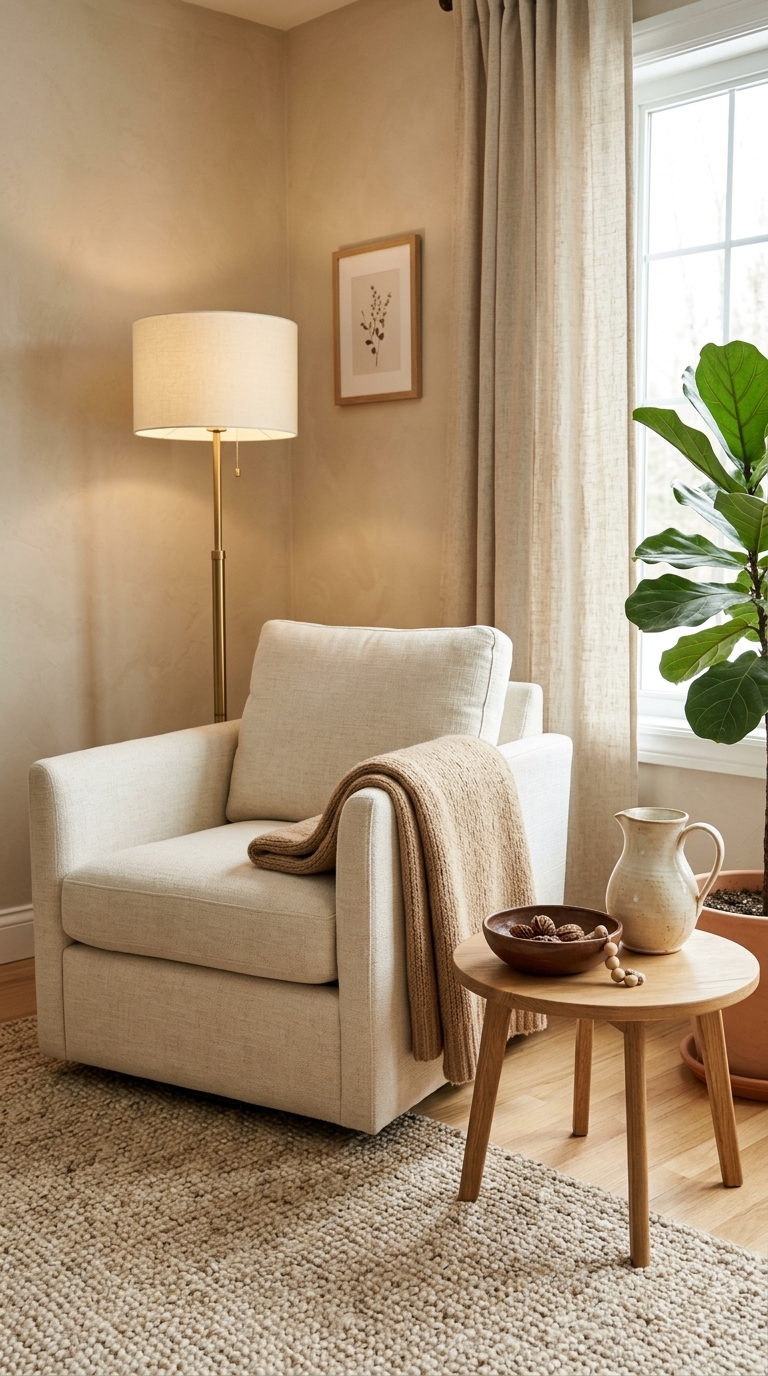
In a living room corner, the look starts with a creamy upholstered seat, layered with an oatmeal rug and a tan throw for that soft, “welcome home” feel. The ceramic pitcher in warm ivory and cocoa bowl add grounding contrast without breaking the neutral harmony. This works because it builds warmth from light-to-medium tones first—perfect for anyone refreshing a living room that currently reads too stark.
2. Choose “cocoa contrast” with espresso-black details
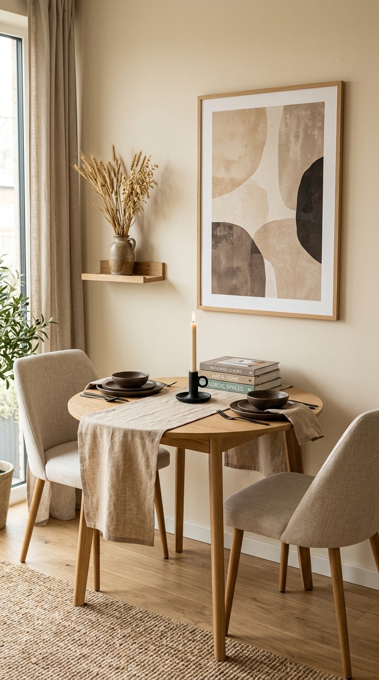
This dining nook uses the idea of cocoa contrast: warm neutrals in the textiles and ceramics, then espresso-black details to sharpen everything. On the table, matte black candle holders and dark ceramic plates make the cream runner and wood surface look even warmer. It’s a great styling trick when you want warmth with structure—like giving your neutral dining space more definition for everyday meals and hosting.
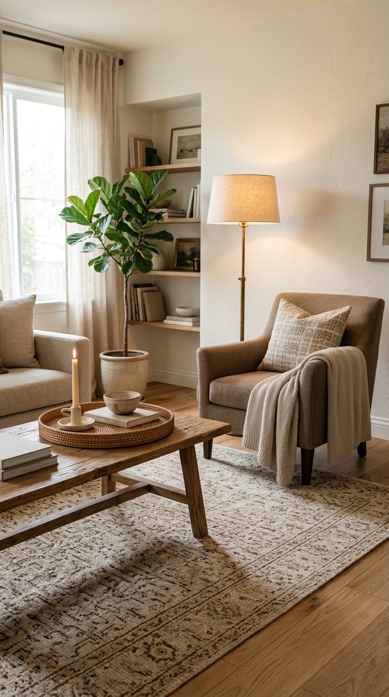
3. Layer texture like it’s the main event (boucle, linen, jute)
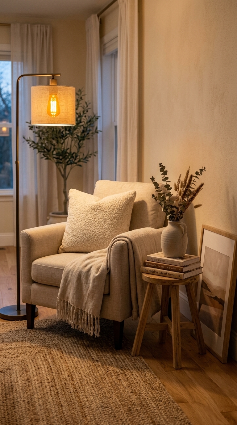
A warm neutral reading corner shows why texture is everything: boucle pillows, a linen throw, and a woven jute rug create depth even when the color palette stays quiet. The textured ceramic vase and book spines add micro-contrast that feels curated, not flat. Use this approach in bedrooms, living rooms, or even entryway benches—especially if your space looks neutral but still feels “empty” or visually flat.
4. Warm up walls with framed art in caramel-toned neutrals
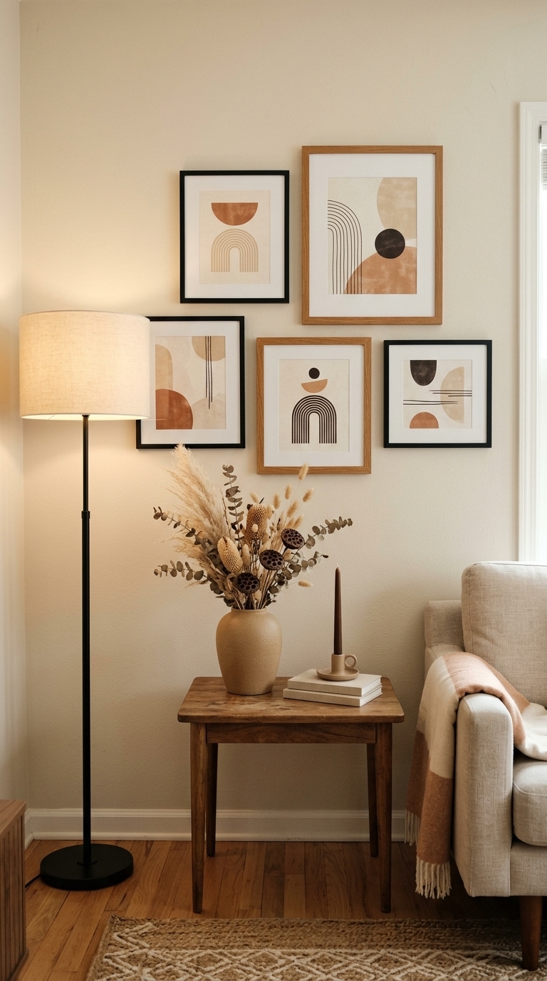
On a living room wall, a mix of slim frames holds caramel-toned neutrals—think sand, cream, soft terracotta, and espresso accents. The warm wood frames and black contrast keep the gallery looking intentional while the artwork adds color warmth without turning the room colorful. This is an easy upgrade for renters and homeowners alike: swap in prints with warm undertones to make your neutral home feel more inviting instantly.
5. Pick a warm-toned rug to “round out” the whole room
A large rug anchored in oatmeal, camel, and cocoa instantly makes the room feel grounded instead of clinical. With a patterned weave, it adds gentle movement while the coffee table styling (tray, candle, bowl) stays calm and cohesive. If you’re working with beige walls or light flooring, this is one of the fastest ways to warm things up—because the rug becomes the color bridge for everything around it.
6. Use warm lighting (not just warmer paint) for that golden glow
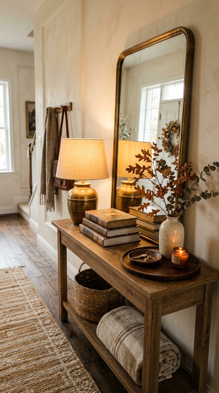
Warm lighting makes a neutral palette feel richer, and this console vignette proves it. A brass lamp with a creamy shade casts golden light across a mirror, textured runner, and layered tabletop objects in cocoa and cream. It’s a simple upgrade with big payoff—especially in rooms with limited natural light—because the glow emphasizes textures and warms undertones instantly.
7. Style tonal shelves with “same family, different depths”
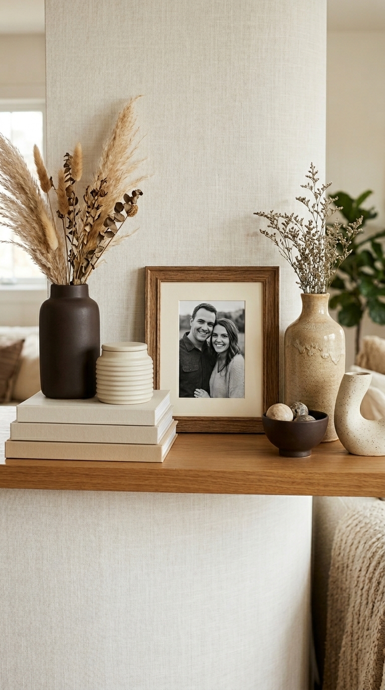
This shelf styling uses a tonal strategy: objects stay within the warm neutral family, but each piece varies in depth—cream ceramics, sandy accents, and espresso-toned details. The mix of heights (tall vases to short jars) creates balance, while the warm wood frame and book stack add everyday “collected” charm. It’s perfect for open shelving that currently looks too matchy—aim for one neutral base, then layer 2–3 darker anchors for warmth.
8. Add a warm terracotta accent (small, but noticeable)
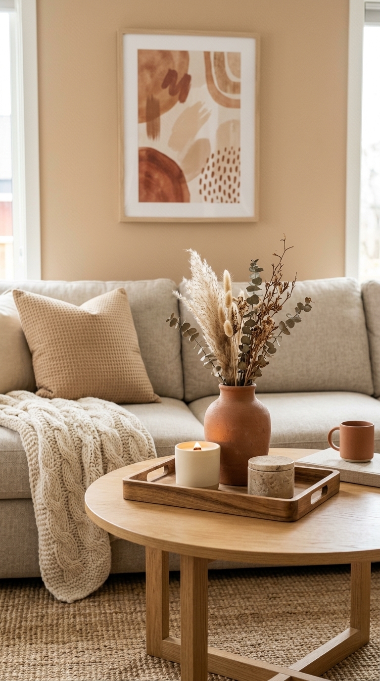
A terracotta accent brings instant warmth to a neutral palette without overwhelming it. Here, the coffee table tray anchors the look with a terracotta vase and cream candle, while the surrounding textiles in beige and warm knit keep the vibe soft and layered. Use this trick when you want your space to feel current—terracotta accents are trending because they look natural, lived-in, and flattering against creams and tans.