
9 Warm Neutral Color Palettes Mistakes to Avoid Before You Decorate
You want a cozy, magazine-worthy room that feels calm and curated—so why do warm neutral palettes sometimes fall flat? In this guide you’ll discover the nine most common warm neutral color palette mistakes to avoid before you decorate, from ignoring undertones to over-simplifying texture. I’ll show what actually makes a warm neutrals scheme sing, how to fix common missteps, and quick swaps that lift a whole room. Read on for the easy styling fixes that keep your space warm, layered, and flawlessly photogenic.
1. Choosing Tones That Are Too Similar — Lose the Flat Beige
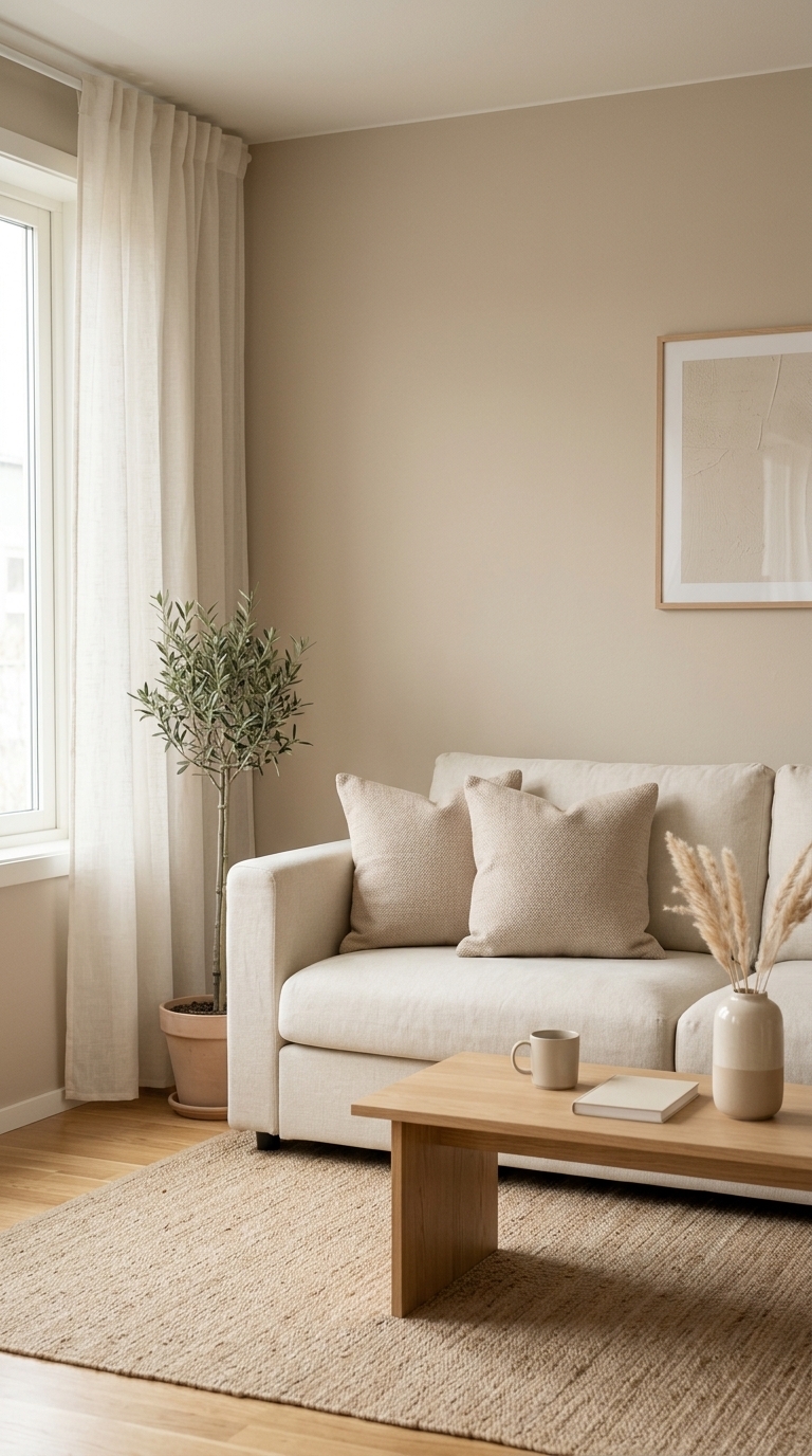
A living room corner shows how almost-identical beiges create a flat, one-note look: cream sofa, matching beige pillows, and a beige wall with little texture. This image demonstrates why mixing warm neutrals with varied depth and undertones matters — add contrast with a darker cushion or a textured rug to bring dimension.
2. Ignoring Undertones — Why Warm Doesn’t Always Mean Warm
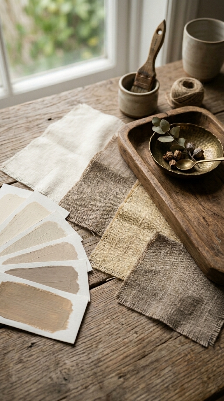
A tabletop shows paint swatches and fabric samples highlighting yellow, pink, and gray undertones side by side, making it obvious how undertones shift the whole palette. This visual teaches you to test swatches in your room light before committing so walls and textiles harmonize. 12 Easy Warm Neutral Color Palettes That Look Polished at Home
3. Forgetting Texture — Add Layers to Prevent a Flat Room
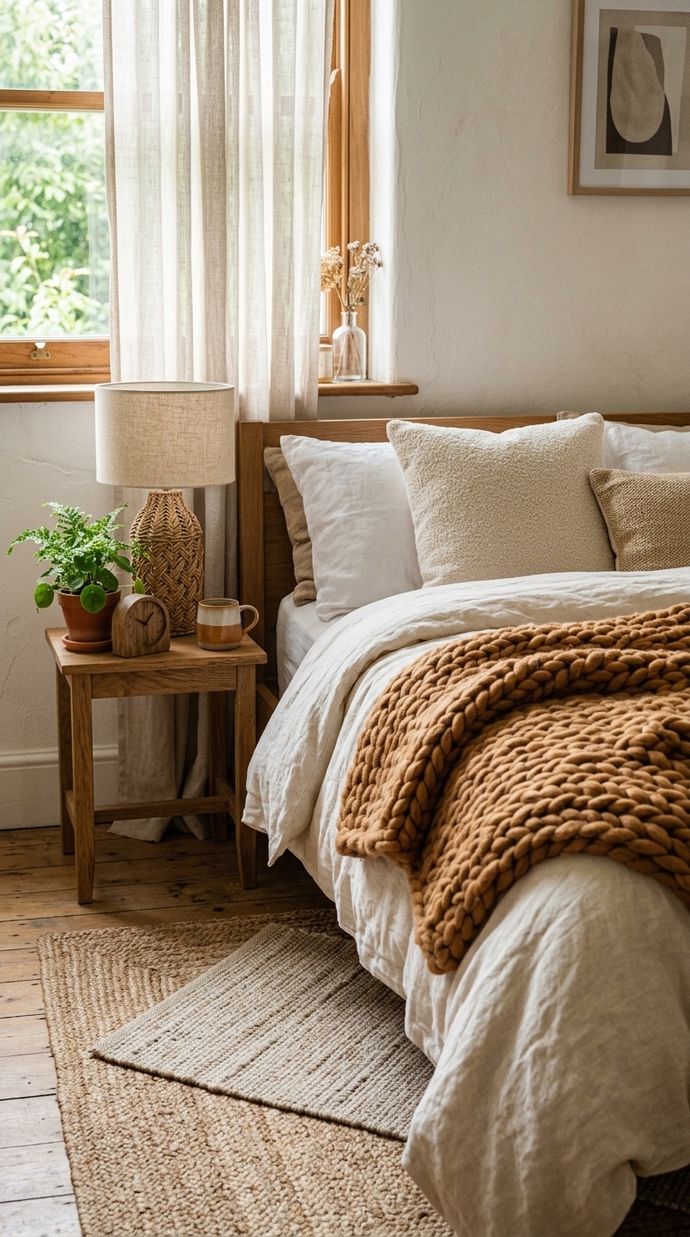
This bedroom corner uses linen, chunky knit, boucle, rattan, and jute to prove that texture brings warmth and depth to neutral schemes. If your palette reads dull, introduce tactile layers across bedding, rugs, and accessories to make the space feel curated and lived-in.
4. Overdoing One Finish — Mix Metals and Materials for Interest
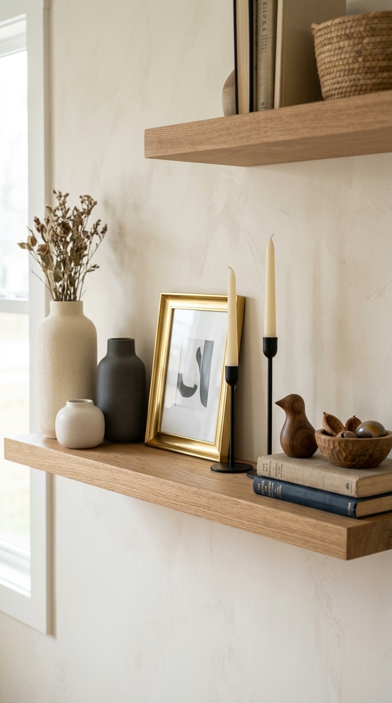
A shelf display pairs brass, matte black, clay, and wood so each finish plays off the others rather than competing. Mixing metals and materials prevents a monotonous look while keeping the warmth intact — aim for 2–3 complementary finishes in one room.
5. Using Only Warm Whites — Let Contrast Anchor the Space
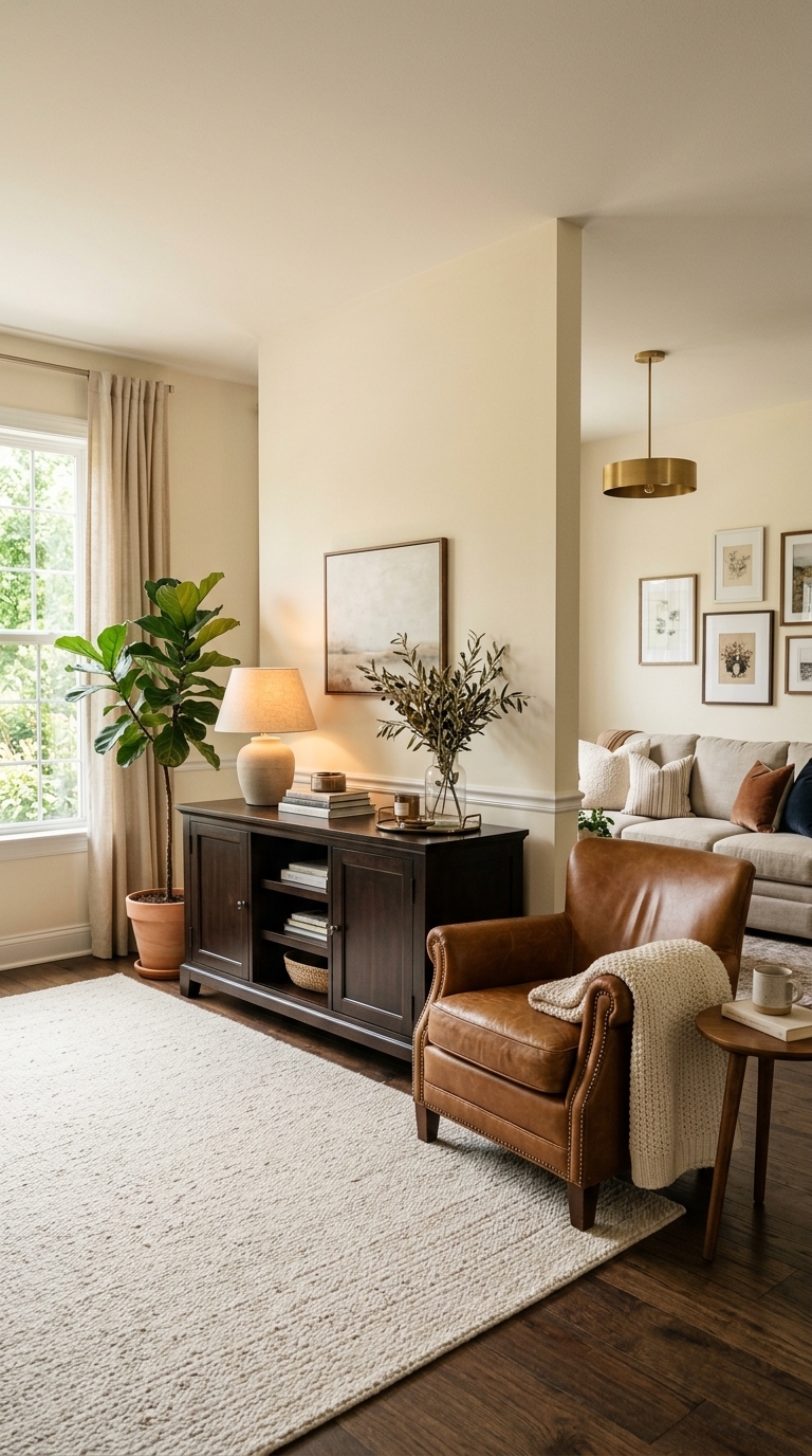
Here a deep espresso console and leather chair ground a room of warm creams and ivories, proving contrast is essential. Introducing a few darker anchors stops a neutral palette from drifting into bland and helps focal pieces pop.
6. Neglecting Lighting — Warm Neutrals Need the Right Light
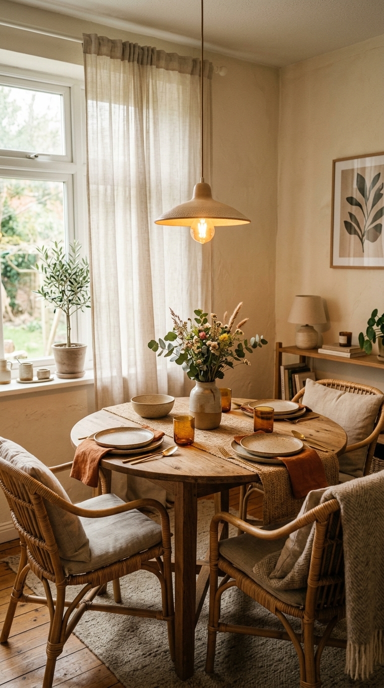
This dining nook shows layered lighting—warm pendants plus daylight—that highlights warm neutrals without washing them out. Natural light and warm bulbs change how pigments read, so test paint and textiles in both day and evening lighting. warm neutral color palettes that look polished at home
7. Skipping Accent Color — A Little Colour Goes a Long Way
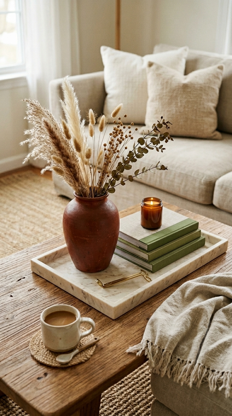
A small terracotta vase and moss-green books inject life into an otherwise neutral coffee table, showing how a single accent color prevents a room from feeling too safe. Use one or two accent hues to guide accessories and artwork without overpowering the warm base.
8. Choosing Low-Contrast Rugs and Floors — Anchor with Pattern or Tone
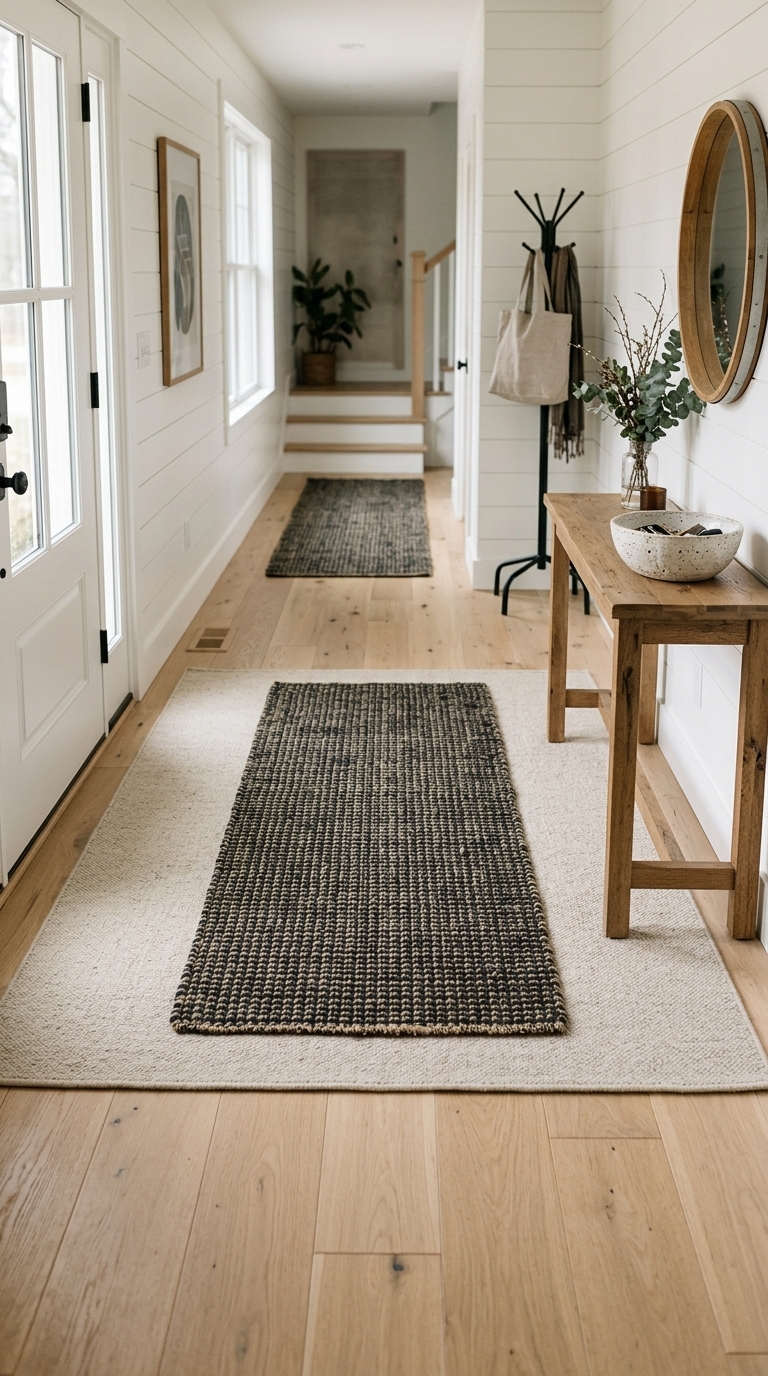
An oak floor paired with a layered runner creates contrast and defines the entryway, whereas a low-contrast rug alone can vanish. Layer patterns or choose slightly darker runners to ground furniture and guide traffic visually.
9. Not Testing Samples in Your Space — The Final, Costly Mistake
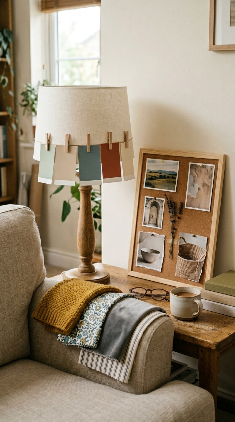
This styling shot shows paint chips and fabric samples taped into place so you can see how each piece reads in your room’s lighting and alongside your furniture. Testing small samples will save time and money and ensure your warm neutral choices look intentional and polished.