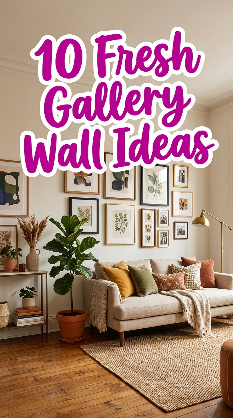
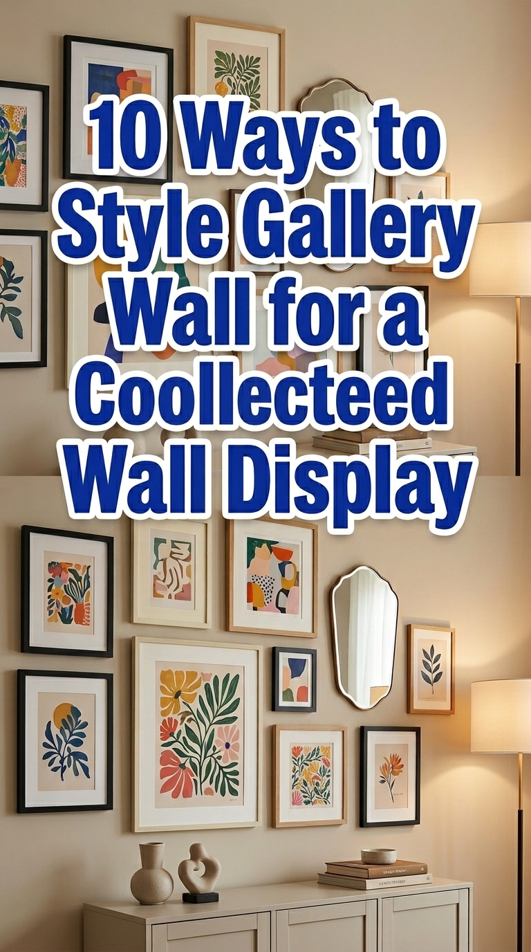
10 Ways to Style Gallery Wall for a Collected Wall Display
If your gallery wall looks a little “random frames, good intentions,” it’s probably missing a styling system. This guide to styling a gallery wall for a collected wall display is all about creating intentional variety—so it feels curated, not chaotic. You’ll learn how to mix frame styles, scale your layout, and add depth with texture, negative space, and meaningful art groupings. Expect practical, Pinterest-friendly ideas you can copy in any room, from hallways to living rooms. Let’s turn blank wall envy into a display you actually love looking at—one layout at a time.
1. Start with a “main piece” so the whole wall feels intentional

A cozy living room wall is styled as a collected gallery display anchored by one larger statement frame, with smaller prints arranged around it. The mix of matte black and natural wood frames, plus white matting, creates a cohesive look while still feeling curated and personal. This layout works beautifully when you want the wall to feel “designed” from a distance—great for entryways or the main wall behind a sofa.
2. Mix frame finishes (black, wood, and cream) without losing cohesion
This image shows a gallery wall collage that blends black, natural wood, and cream frames while keeping the overall vibe cohesive through consistent mat spacing. The prints include soft earthy tones—sage, warm beige, and muted terracotta—so everything feels collected rather than mismatched. It’s a smart approach for renters or anyone who’s slowly adding pieces over time, because you can mix what you have while still looking polished.
3. Play with scale: larger art, smaller accents, and breathing room
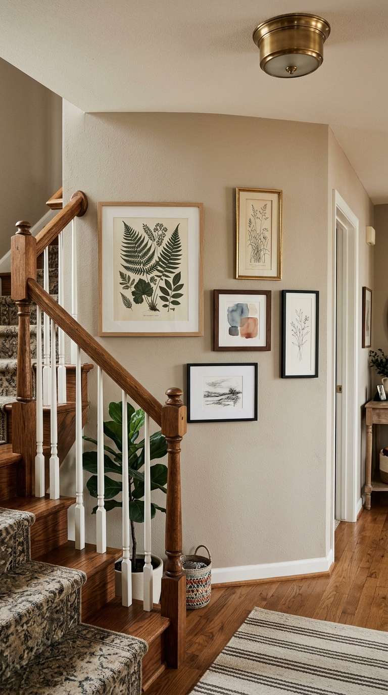
In a hallway corner, the gallery wall uses thoughtful scale: one medium-large piece sets the rhythm, smaller frames act as accents, and negative space prevents the arrangement from feeling crowded. The mix of horizontal and slim vertical frames adds movement, while the warm neutral wall keeps the display calm. This is ideal when you want collected-wall charm without the “all at once” overload.
4. Repeat a colour in 3+ frames to make the collection feel curated
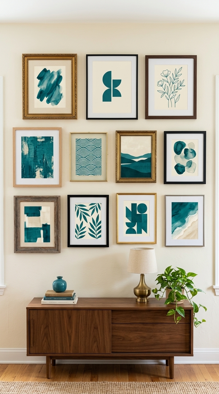
This gallery wall display repeats a deep teal accent across multiple artworks, even though frame shapes vary. The consistent light mats and warm cream background tie everything together, so the wall reads as a curated collection instead of a random stack. It’s a great trick for Pinterest-style cohesion—choose one “hero” colour and sprinkle it through at least three pieces.
5. Layer in depth with mixed elements: art + one small mirror
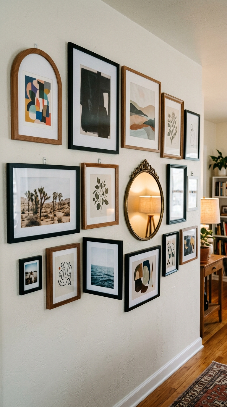
A collected gallery wall combines framed art with one small mirror to add depth and sparkle without clutter. The mirror’s reflection brings extra dimension, while the rounded arch frame softens the overall look against the sharper rectangles. This styling trick is perfect for entryways or living rooms where you want the wall to feel dimensional and bright.
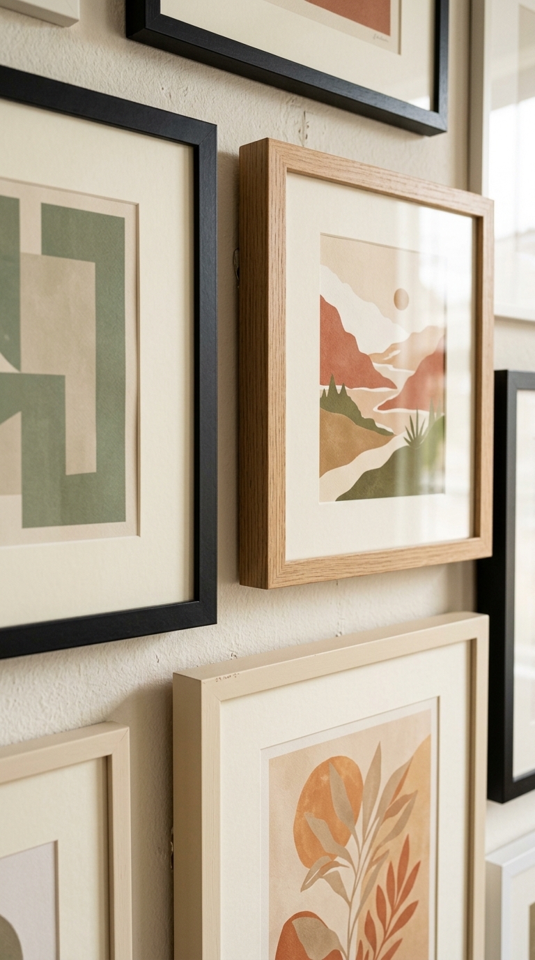
6. Use a consistent mat width for that “designed by you” finish
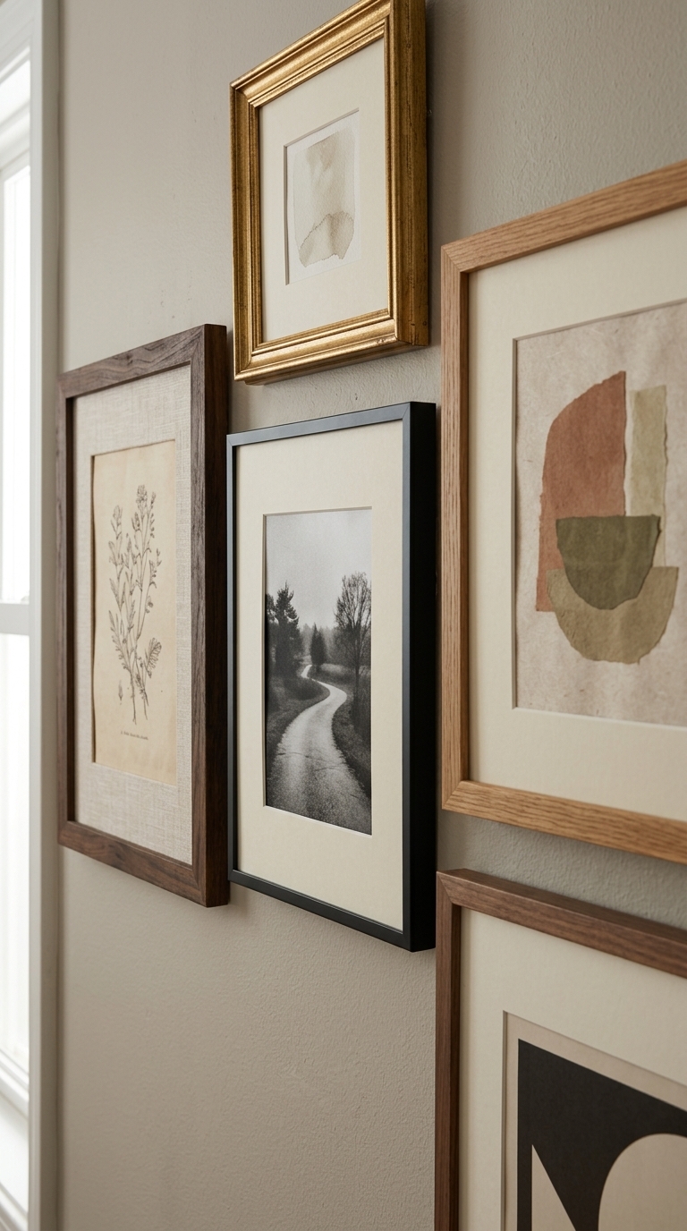
This close-up shows how consistent mat width instantly elevates a collected wall display. Even with different frame finishes, the matching mats create a uniform visual structure, making the arrangement look intentional and thoughtfully edited. It’s an easy way to get that high-end gallery feel—especially if you’re mixing thrifted finds with newer prints.
7. Arrange by “shape rhythm”: mix horizontals, verticals, and one arch
A collected gallery wall uses shape rhythm by combining rectangular frames, slender vertical pieces, and one arched statement frame. The arch naturally draws the eye, while the verticals add height and the rectangles keep the layout grounded. This is a great styling choice when you want your display to feel curated but still playful—perfect for a media wall or a dining nook.
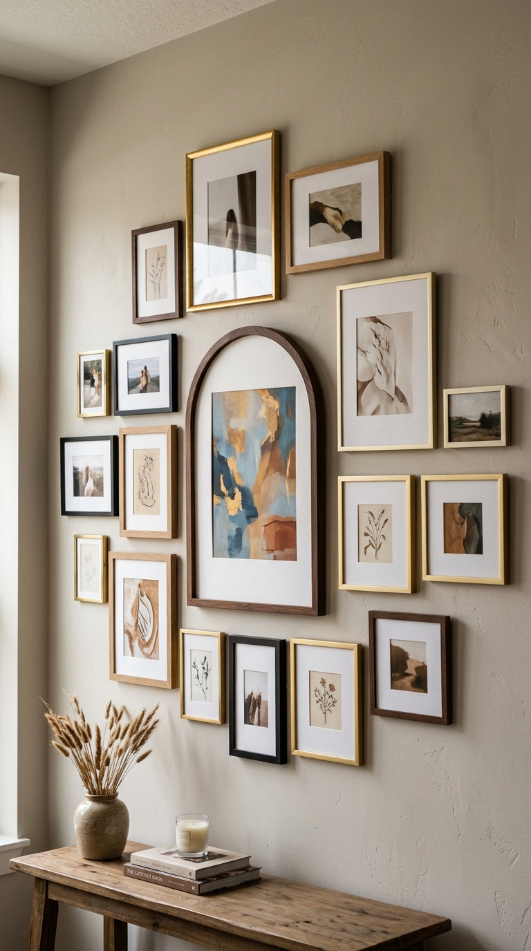
8. Put a small rail or console beneath to balance the wall visually
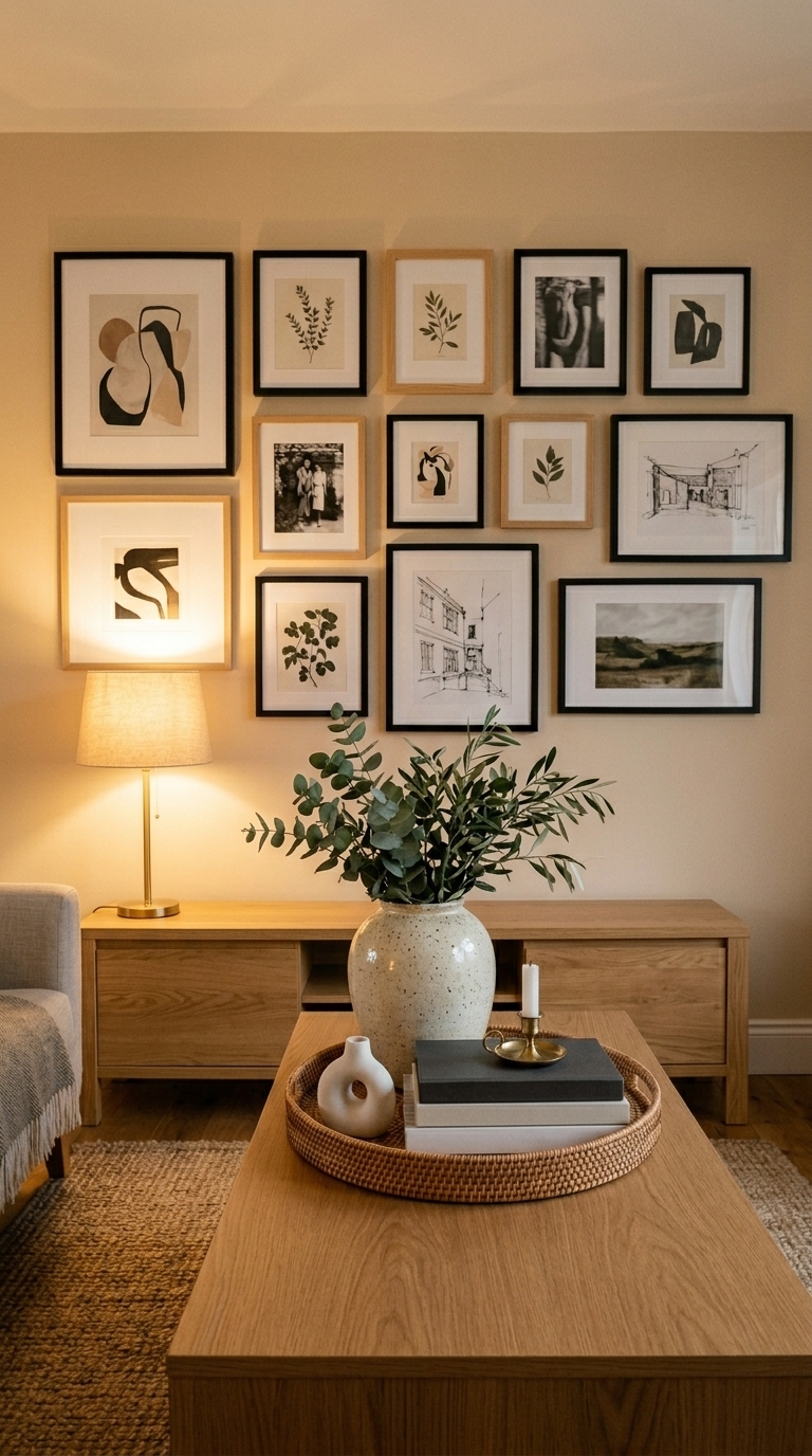
This scene shows a gallery wall paired with a styled console table below, creating a balanced collected look. The frames sit in a clean arrangement above, while the console uses a few intentional objects—ceramic, a tray, and books—to echo the curated feel. It works especially well in living rooms and entryways where the wall needs “support” from the space below.
9. Choose one theme for the art (botanical, abstract, or typography-like) and repeat it
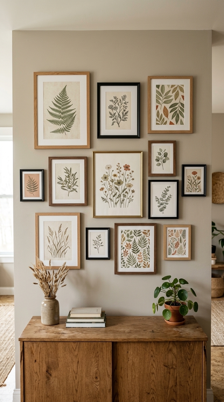
A cohesive theme ties the gallery wall together: botanical-inspired art in muted greens and warm creams, repeated across multiple frames. The varied frame materials keep it interesting, but the artwork category creates instant harmony. This is a smart collected-wall strategy if you want the display to feel meaningful without overthinking every individual piece.
10. Finish with intentional spacing rules so it looks curated (not crowded)
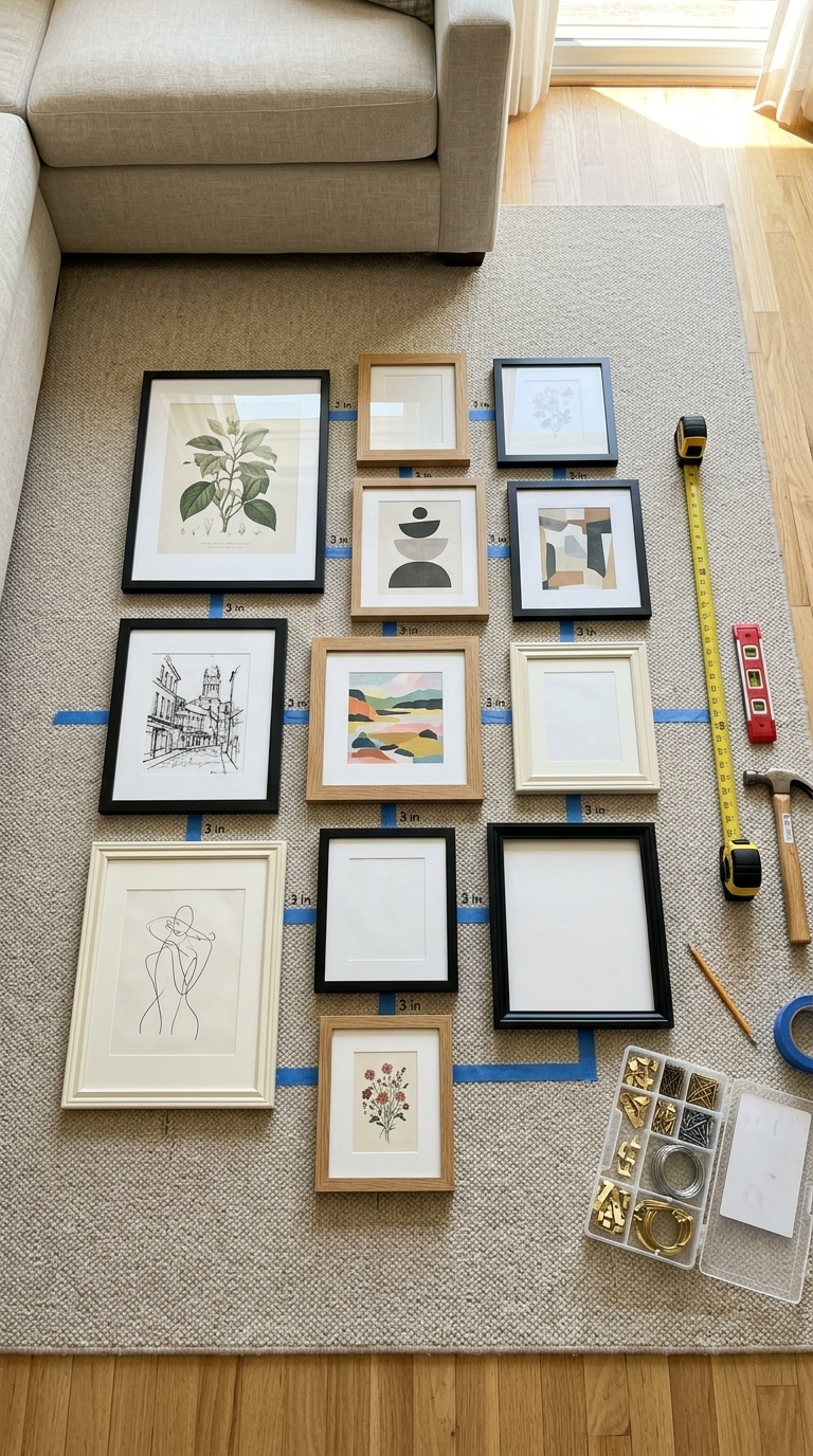
This flat-lay styling moment shows the “secret” to a collected gallery wall: consistent spacing before anything goes up. The frames are arranged with intentional gaps and alignment marks, helping the final wall read clean and curated. You can use this method in any room—hallways, stair landings, or living rooms—especially when mixing different sizes and frame finishes.