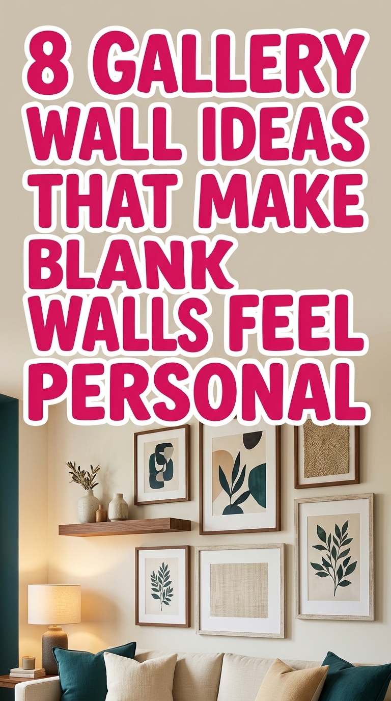
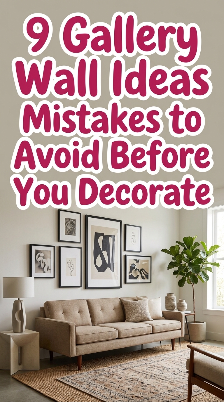
9 Gallery Wall Ideas Mistakes to Avoid Before You Decorate
Thinking of a gallery wall refresh but worried it’ll end up looking messy or amateur? This guide to gallery wall ideas mistakes to avoid before you decorate will save the whole vibe—no second-guessing, no wasted holes. You’ll get nine clear, stylish fixes for scale, spacing, theme, lighting, hardware and more so your wall reads like a polished, magazine-worthy vignette. Read on for quick, visual rules you can use the next time you plan a gallery wall.
1. Measure Before You Hang — Avoid Wrong Scale
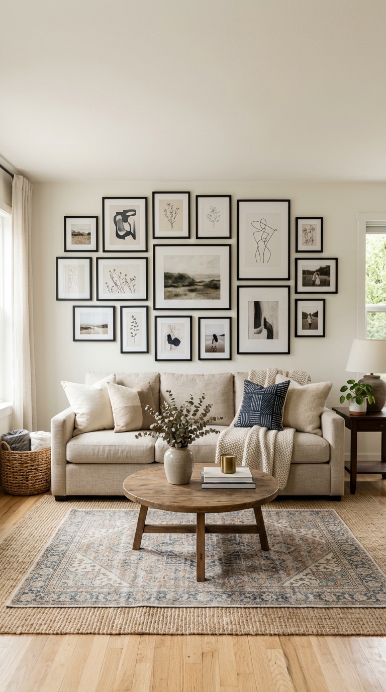
A living room sofa anchors a gallery wall that spans about two-thirds of the couch width—large and small frames are arranged so nothing looks dwarfed or overpowering. The neutral palette, rattan lamp, and textured rug show how scale ties artwork to furniture
2. Mix Frames Intentionally — Stop Random Mismatches
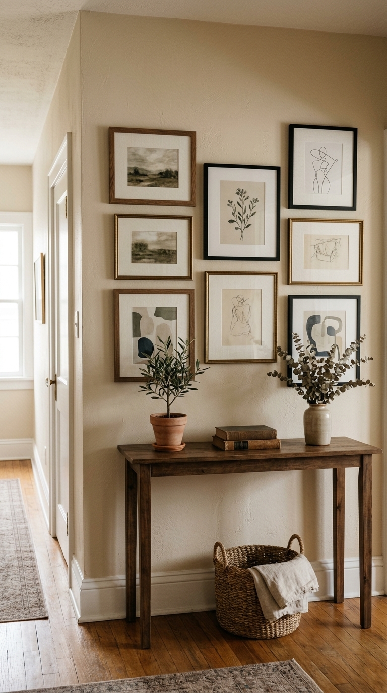
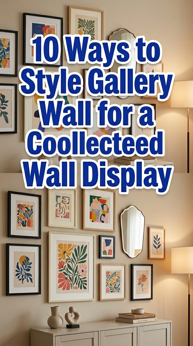
A console table under a mixed-frame gallery proves that varied frame styles can read cohesive when the mat color or artwork palette is consistent. This curated mix feels collected-not-chaotic and works well in entryways or narrow hallways where unified tones keep the look polished.
3. Plan a Layout First — Don’t Wing the Arrangement
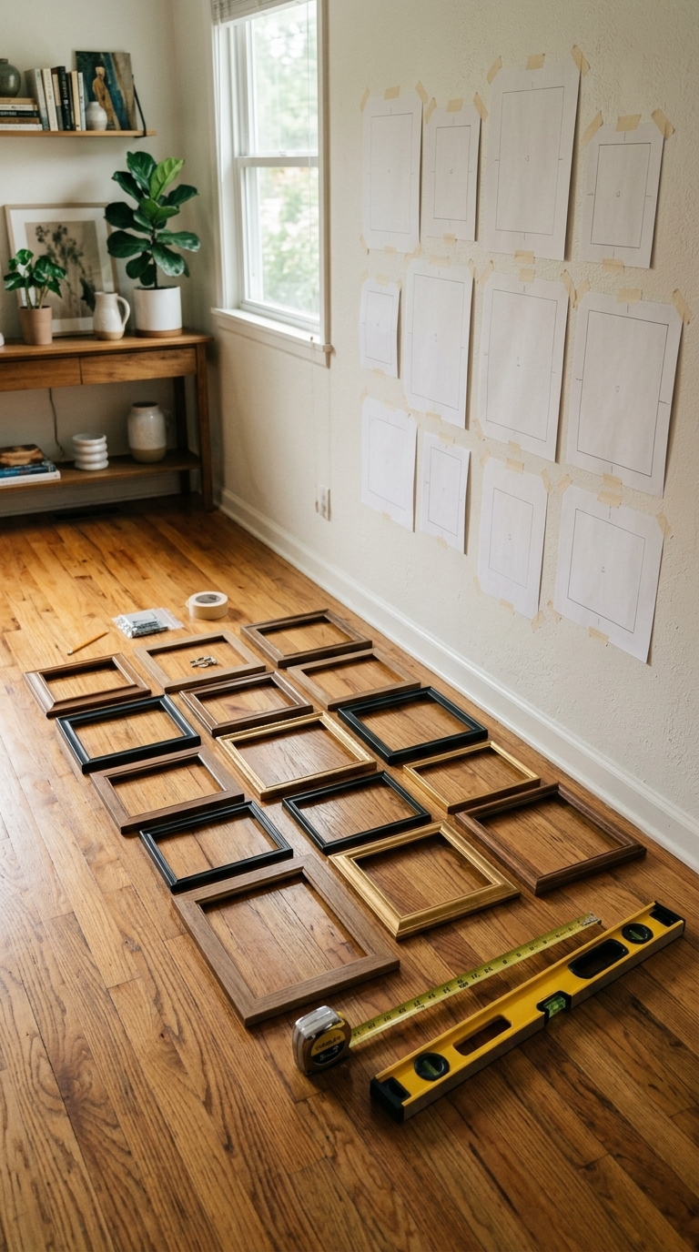
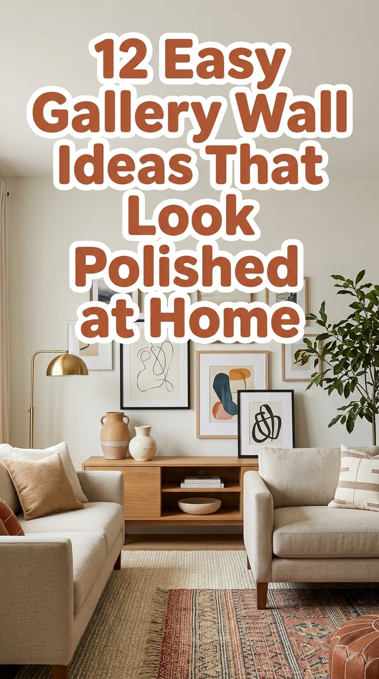
Frames arranged on the floor and paper templates on the wall show a pre-planned layout—this visual planning prevents awkward gaps and last-minute rehangs. It’s a practical step for any room and makes complex arrangements much easier to execute. 12 Easy Gallery Wall Ideas That Look Polished at Home
4. Keep a Cohesive Theme — Avoid Visual Clutter
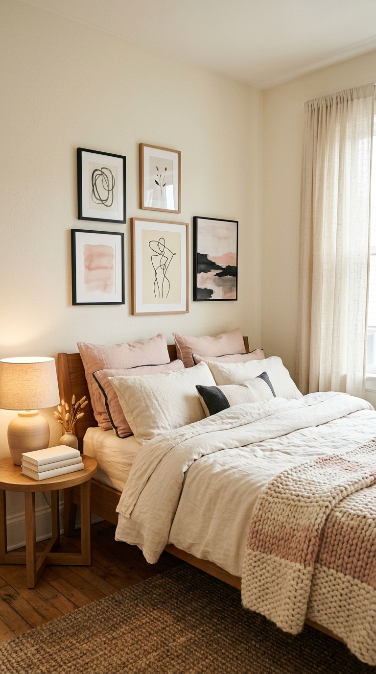
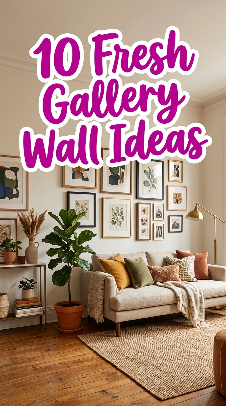
A bedroom gallery wall using a tight color story and similar frame widths keeps the mood calm and cohesive, pairing perfectly with linen bedding and natural textures. This approach fits modern boho or soft minimalist trends and helps art support the room’s atmosphere rather than compete with it.
5. Mind Frame Spacing — Stop Uneven Gaps
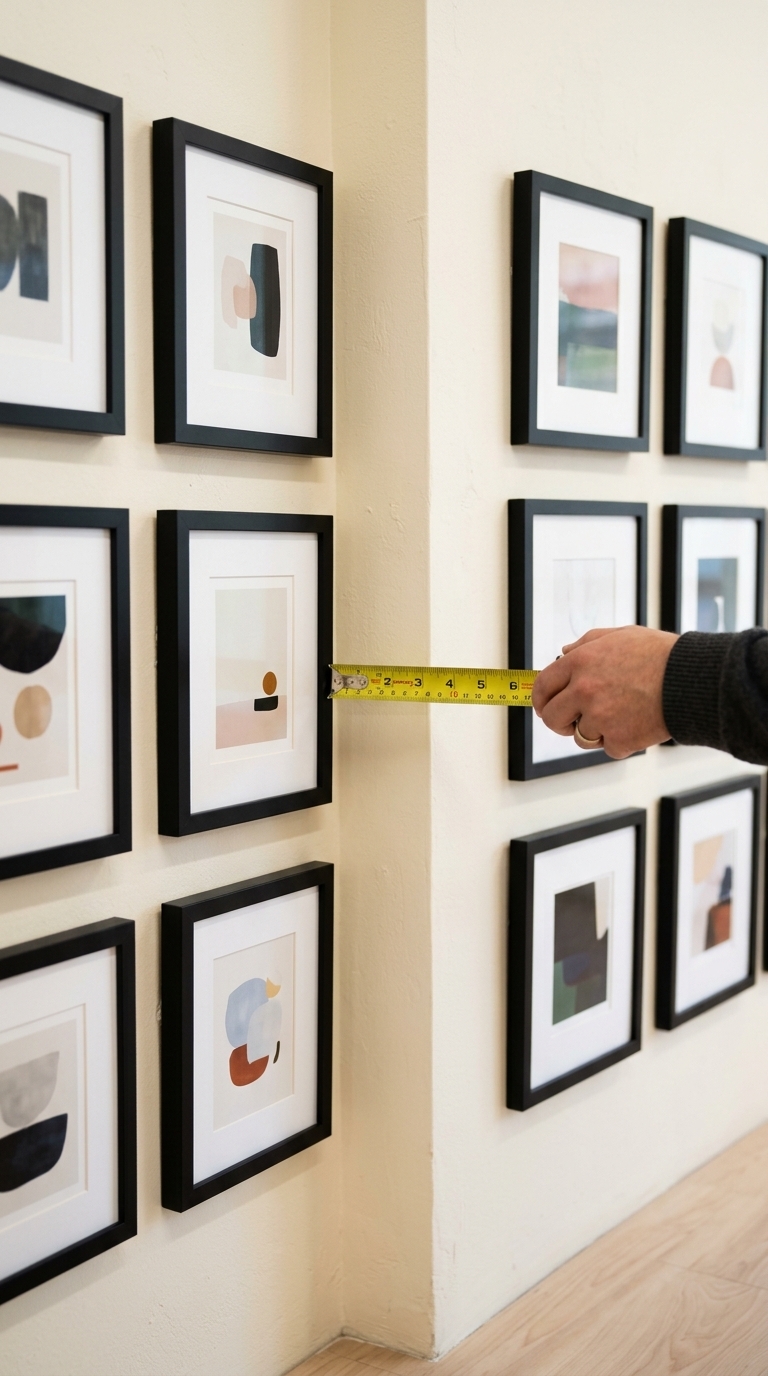
A close-up captures perfectly even gaps between frames, which instantly feels tidy and intentional
6. Balance Large & Small Pieces — Ditch the Heavy Side
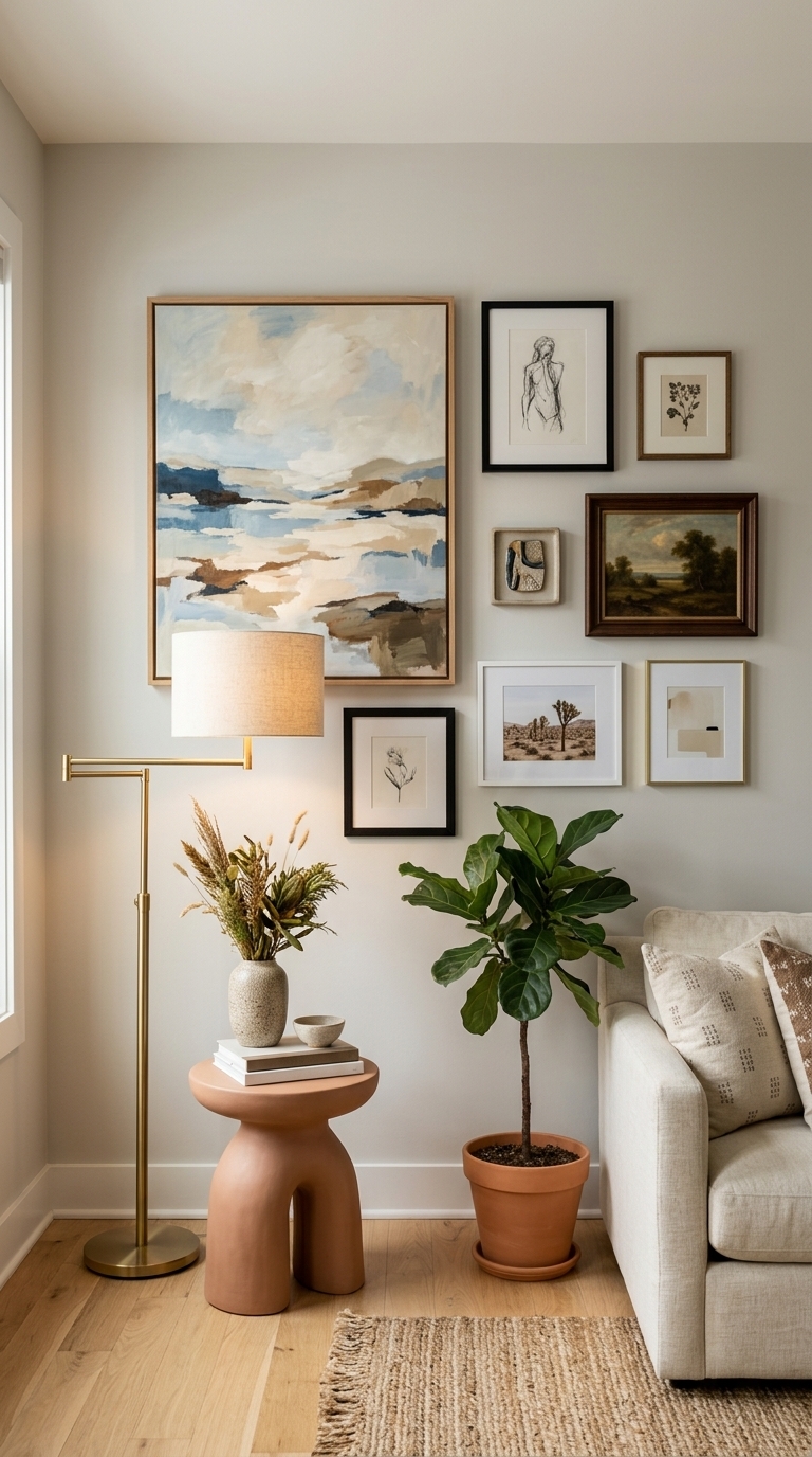
This living room uses a single large piece as an anchor, balanced by smaller works to create movement without crowding one side. Mixing scales thoughtfully avoids a lopsided look and is ideal for open-plan spaces where the wall needs visual weight without overwhelming the room.
7. Consider Lighting — Don’t Let Art Go Dark
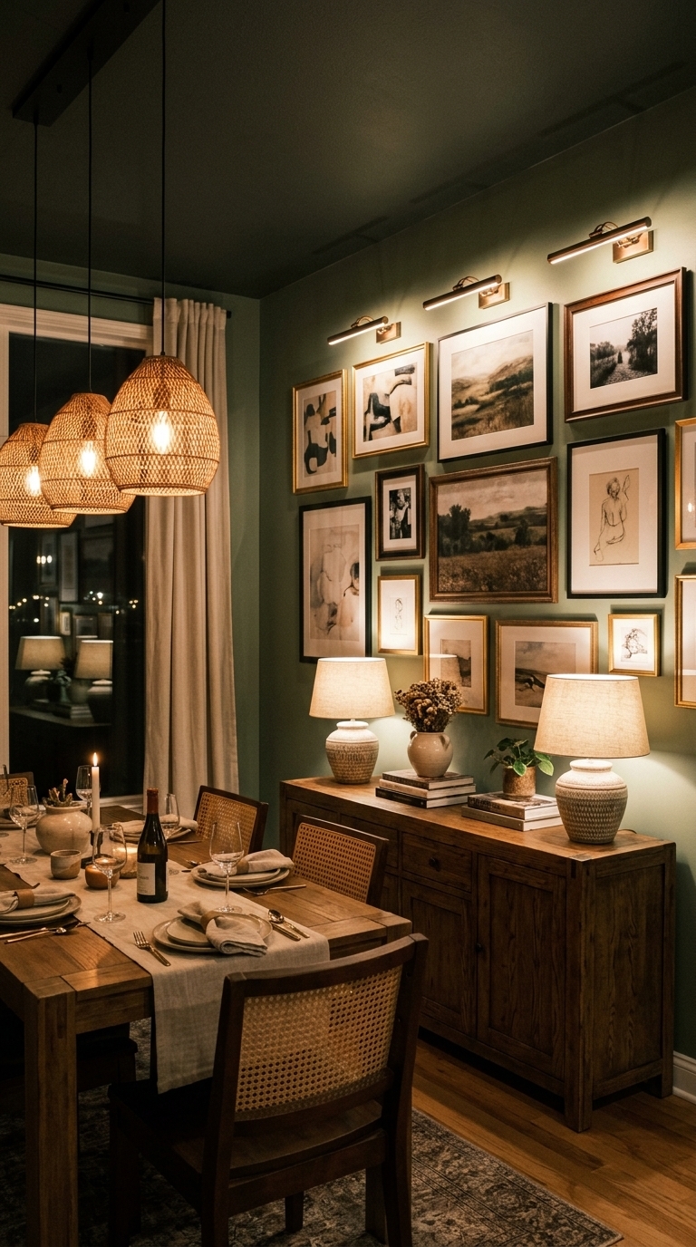
A dining gallery lit with picture lights and layered lamps makes each artwork readable and adds depth to the wall
8. Choose the Right Hanging Hardware — Avoid Sagging Frames
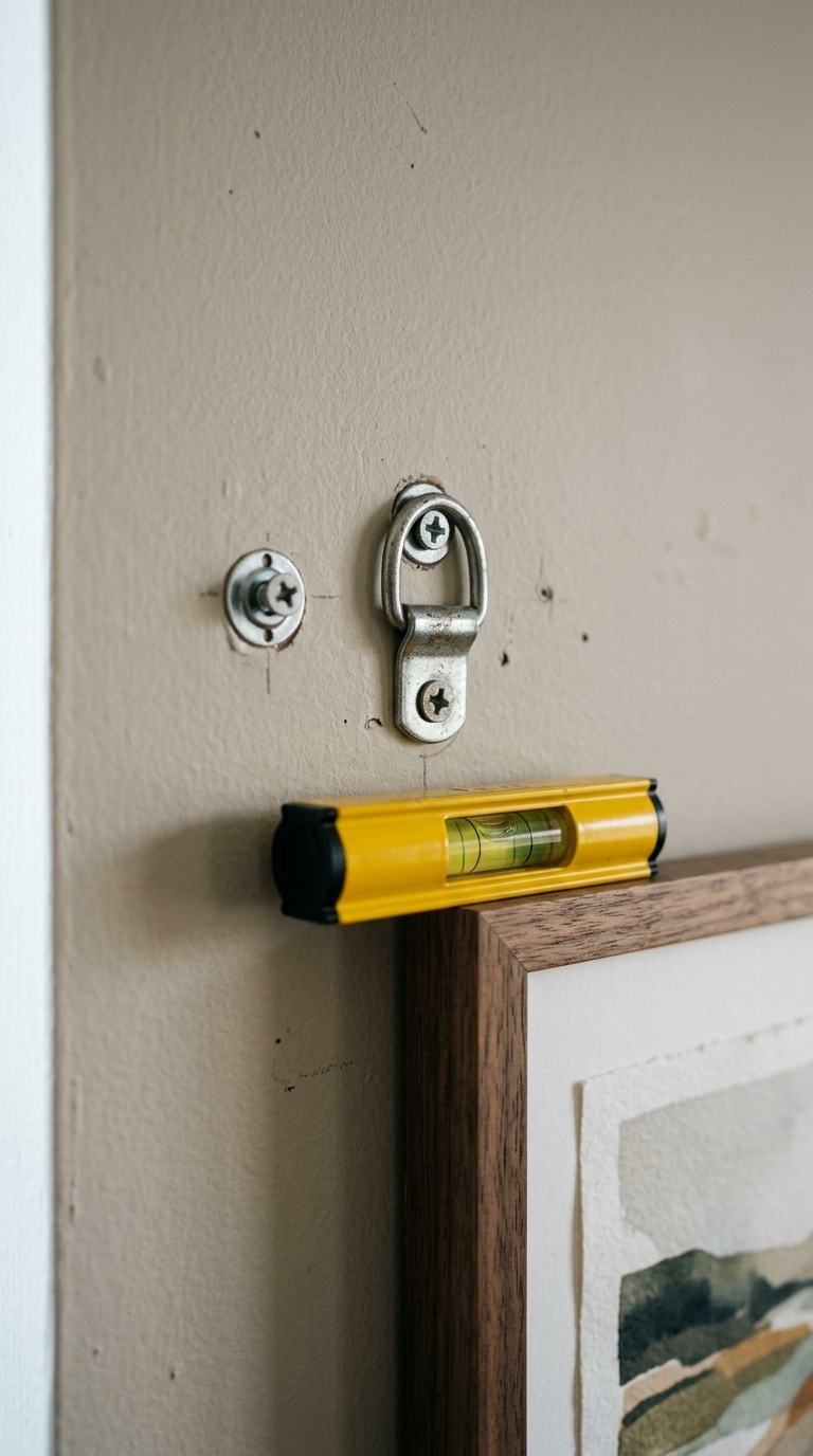
A hardware close-up shows sturdy anchors and D-rings ready to support frames securely—using the right hardware prevents sagging and crooked art. This is a practical detail for renters and homeowners alike and keeps gallery walls looking crisp over time.
9. Edit Ruthlessly — Skip Anything That Doesn’t Elevate
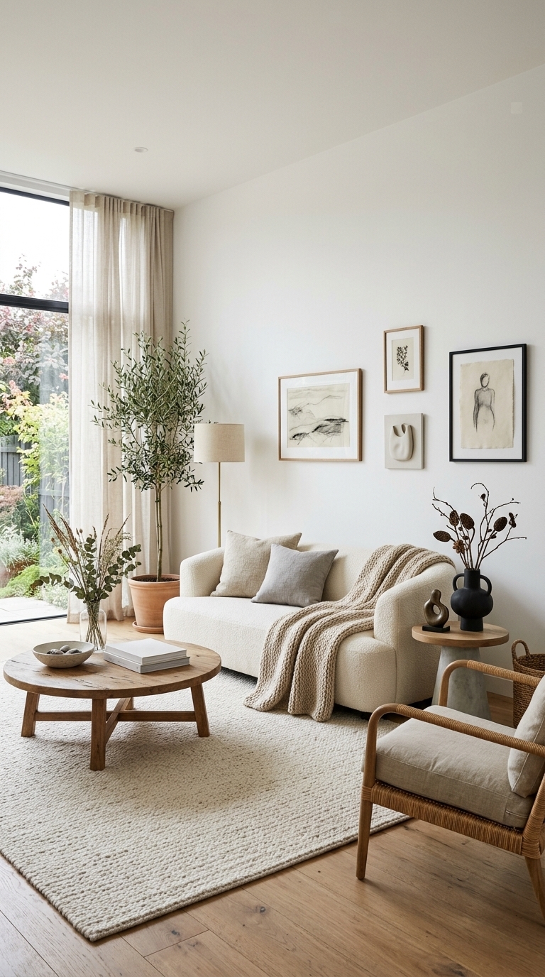
A pared-back gallery with breathing room proves that less can look luxe—negative space highlights each piece and creates a relaxed, gallery-like feel. Use this edit-first mindset when planning any wall