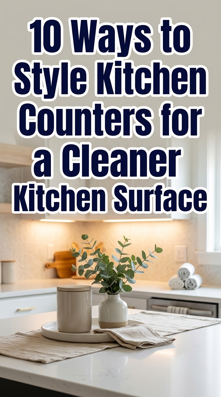
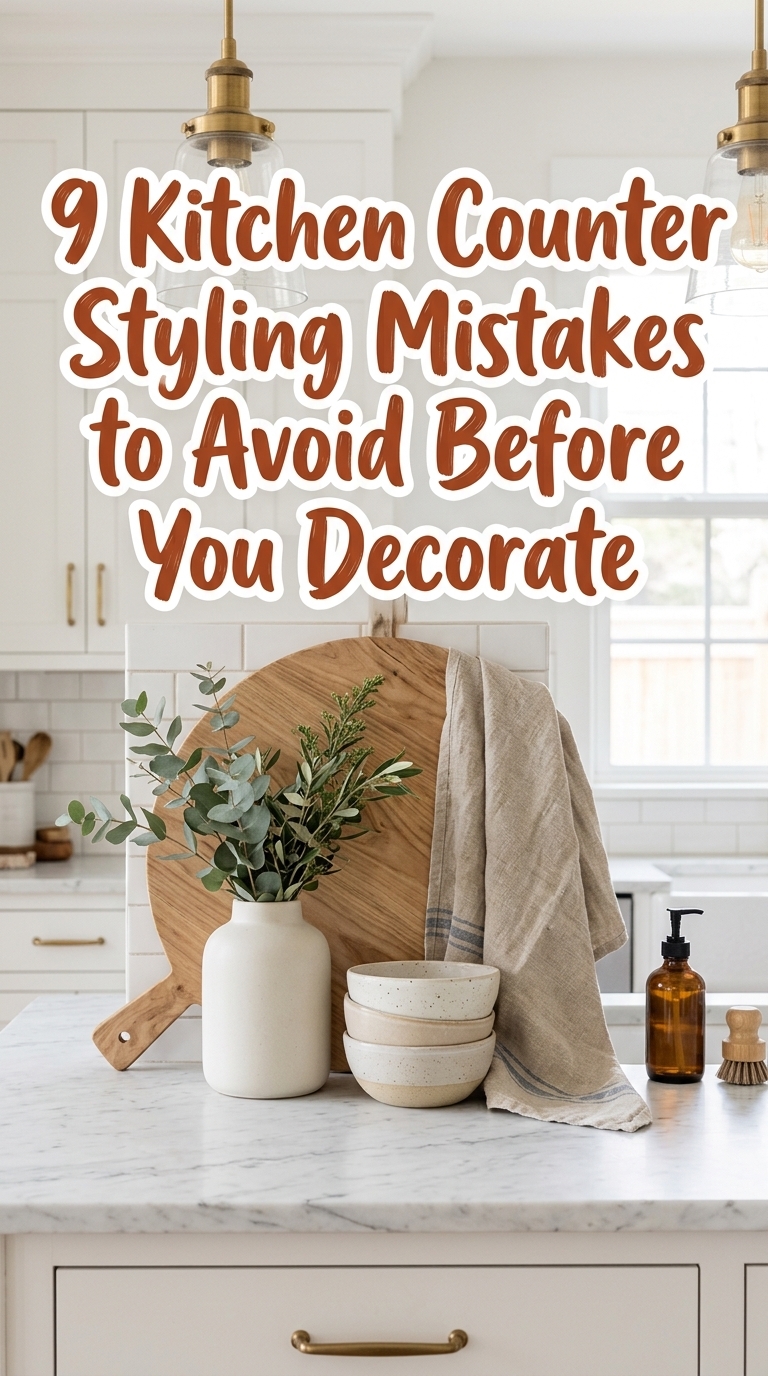
9 Kitchen Counter Styling Mistakes to Avoid Before You Decorate
Dreaming of a kitchen that looks effortlessly styled on Pinterest but actually works for real life? Kitchen counter styling can make or break a room — and one small mistake turns a pretty vignette into clutter fast. This post walks you through nine common counter styling mistakes to avoid before you decorate, so your counters feel curated, functional, and photo-ready. Expect practical fixes, trend-forward tips, and easy swaps that keep your space tidy and stylish. Ready to style counters that look intentional (not accidental)? Let’s start with mistake number one.
1. Overcrowding the Counter — Why Less Looks Luxury
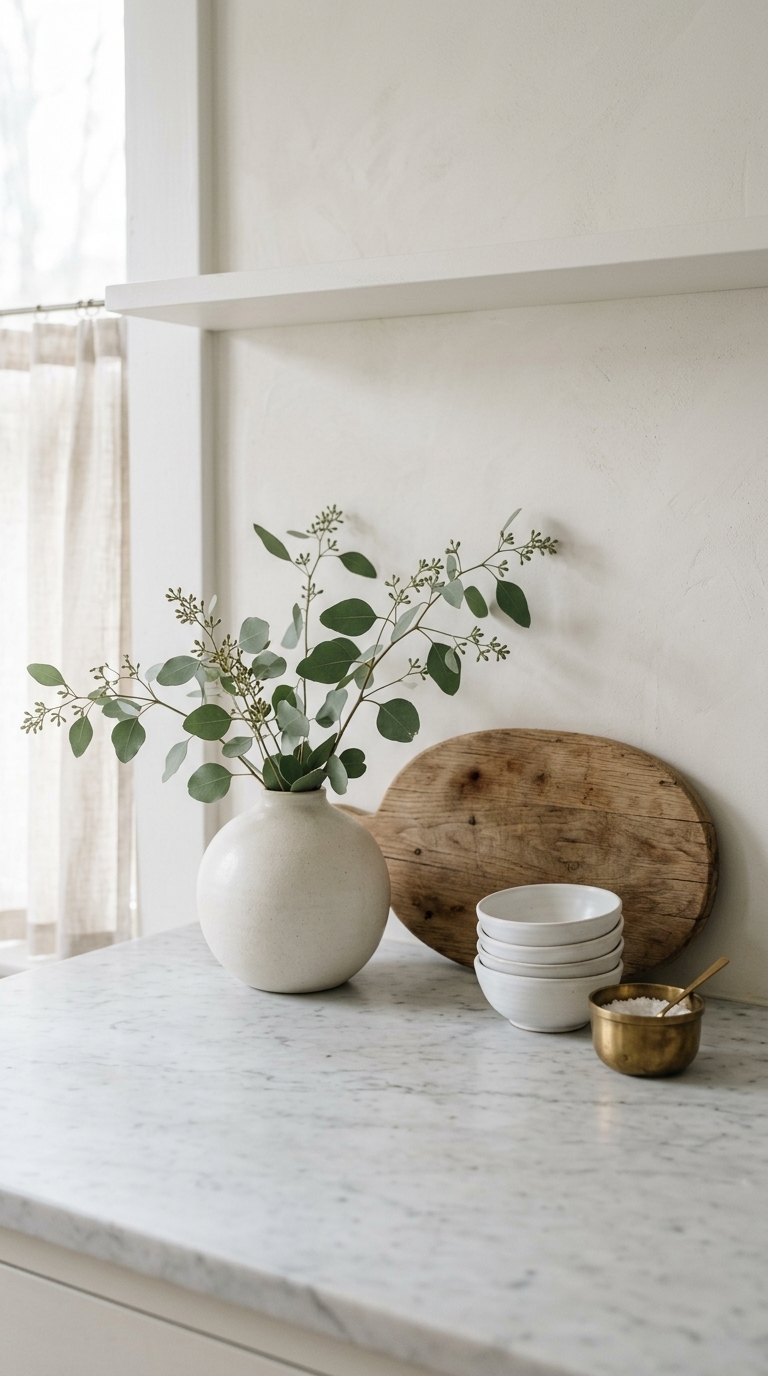
This image shows a clean counter with intentionally left empty space, a wooden cutting board, a lone ceramic vase, and a small bowl in warm neutrals. The breathing room highlights each object and reads as high-end rather than cluttered, perfect for modern, minimal, or Scandinavian kitchens. For a quick refresh, remove duplicates and group items so surfaces feel curated, not overcrowded. 8 Kitchen Counter Styling Ideas That Make Counters Look Useful And Pretty
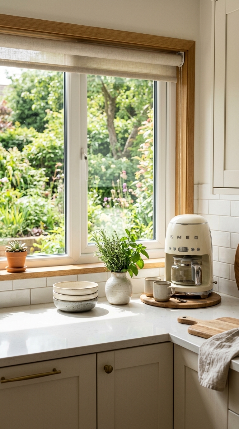
2. Ignoring Functional Zones — Create Work, Prep, and Display Areas
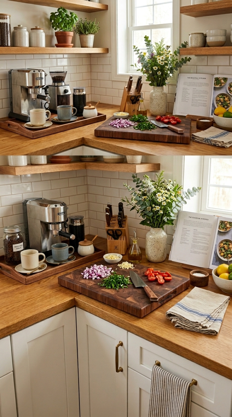
The photo demonstrates three purposeful counter zones — coffee, prep, and display — using trays and boards to anchor each area and protect surfaces. Zoning keeps daily tasks efficient and prevents decorative items from migrating into workspaces, making the counter both beautiful and useful. Use trays, small risers, or baskets to define each zone and keep frequently used tools within reach. 12 Easy Kitchen Counter Styling Ideas That Look Polished at Home
3. Choosing Pieces That Are the Wrong Scale
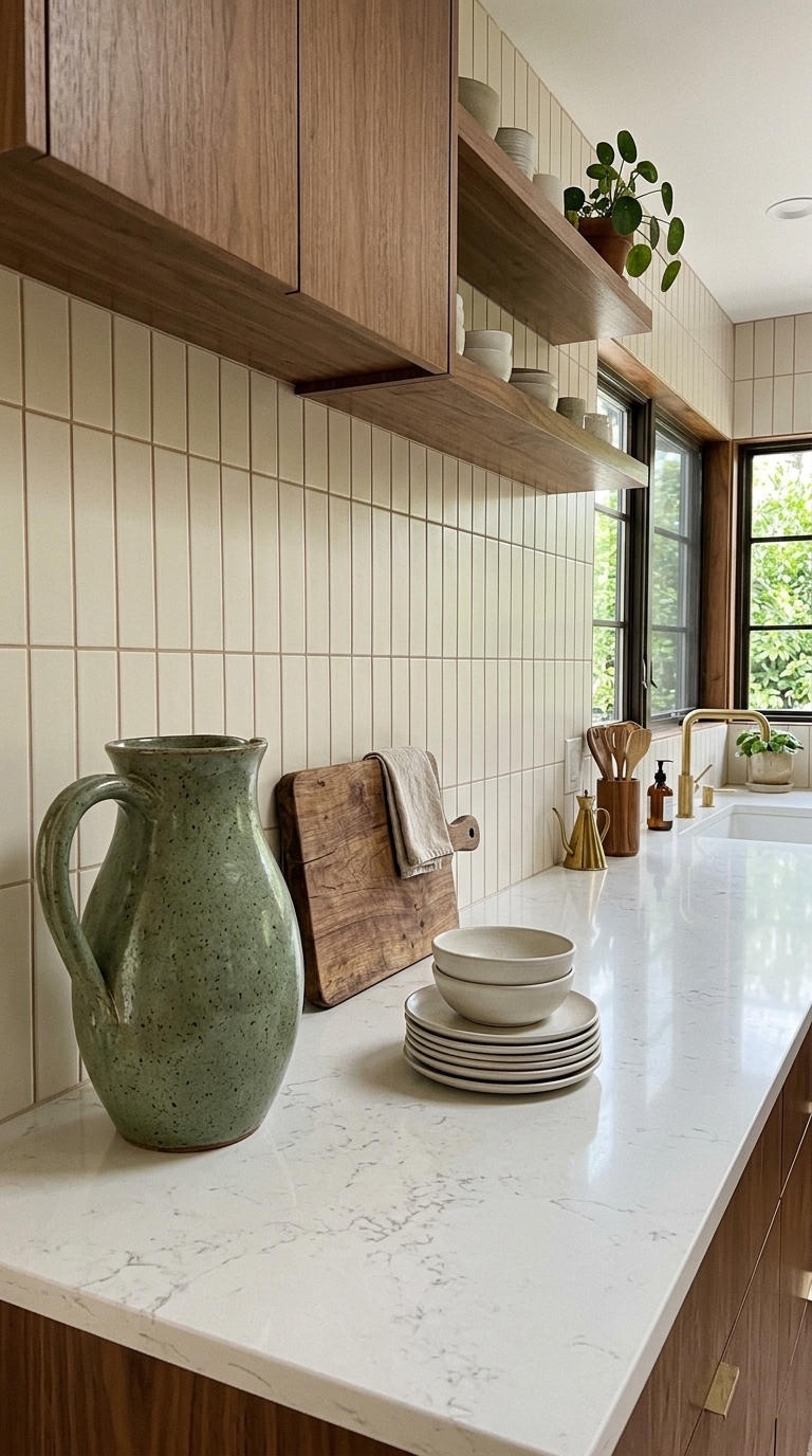
This image uses varied scale — a large pitcher paired with mid-size boards — to create visual interest without clutter. Picking items that are too small makes counters look busy, while too-big pieces overwhelm the space. Balance tall, medium, and low objects to build a layered, editorial look that photographs well and functions in daily life.
4. Mixing Too Many Materials or Finishes
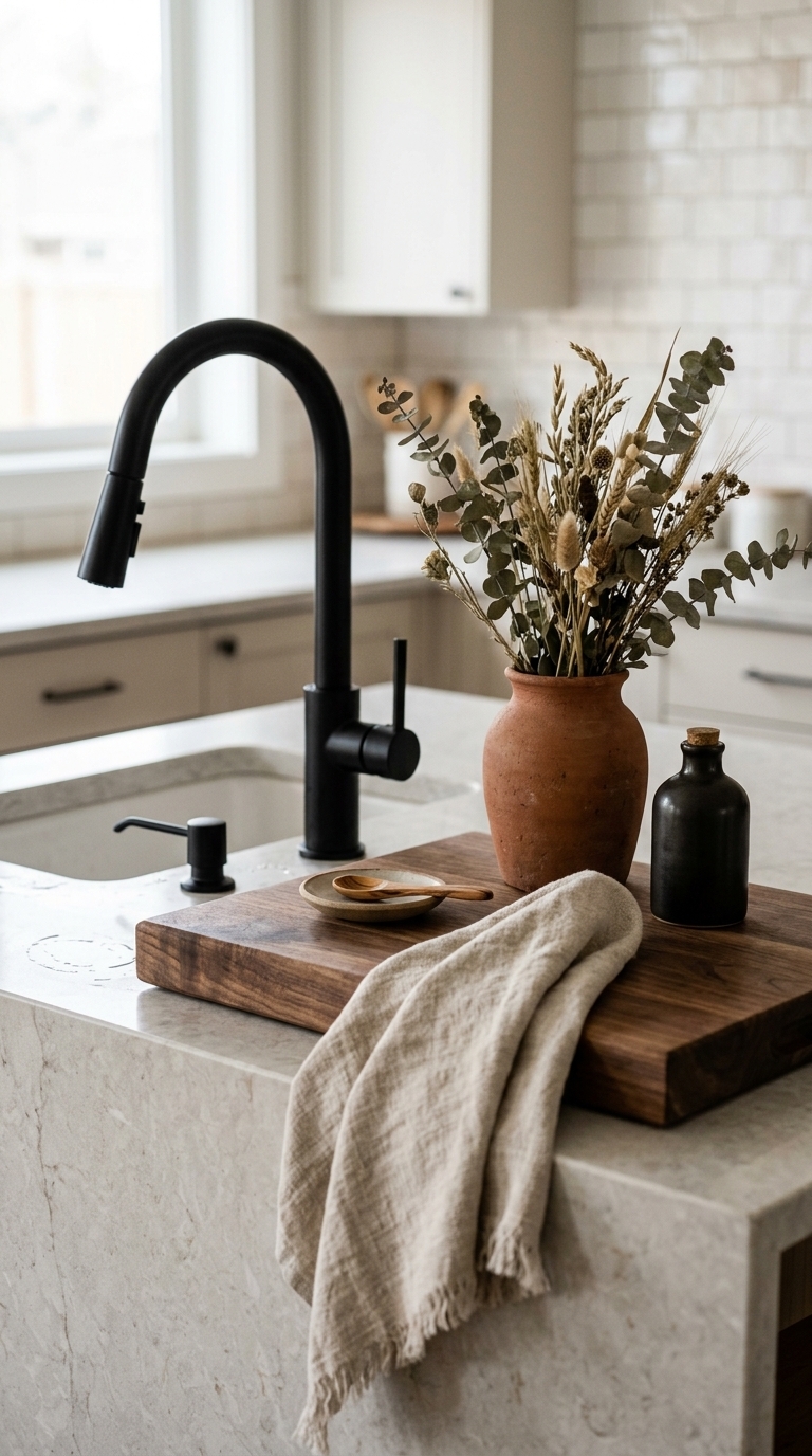
Here, a limited palette of materials — wood, matte black metal, terracotta, and linen — creates a cohesive, textured vignette. Mixing too many metals or finishes can read chaotic
5. Forgetting a Cohesive Color Palette
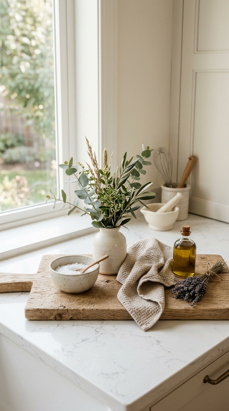
This scene shows a harmonious neutral palette with a single green accent, which feels calm and thoughtfully styled rather than haphazardly collected. A cohesive color story ties disparate objects together and helps small decor choices read as intentional. Pick two main tones plus one accent and repeat them across the counter for an editorial finish. 12 Easy Kitchen Counter Styling Ideas That Look Polished at Home
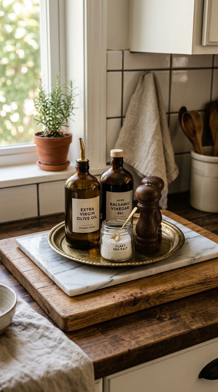
6. Styling With Nonfunctional, Dust-Gathering Items
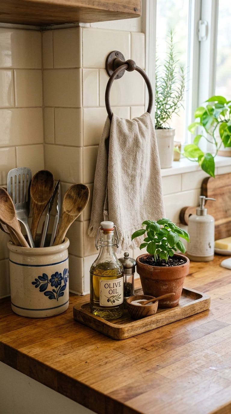
The image focuses on decor that also serves a purpose — utensil crocks, oil dispensers, and herbs — so countertops stay useful and low-maintenance. Decorative-only items that collect dust or grease quickly become eyesores
7. Blocking Light or Workspace With Tall Decor
This photo shows low, unobtrusive styling that preserves window light and keeps prep space clear. Tall or bulky decor near sinks and windows can block light and make the area feel cramped. Keep taller objects to the edges or upper shelves so the main counter remains functional and airy.
8. Forgetting to Protect Surfaces — Use Trays and Boards
Layered boards and a tray create a dedicated spot for oils and frequently used items, protecting the countertop from drips and stains while adding depth to the styling. Using a tray also makes cleaning and reorganizing fast — slide it away when you need workspace and bring it back for display.
9. Missing Vertical Layers — Add Height and Texture
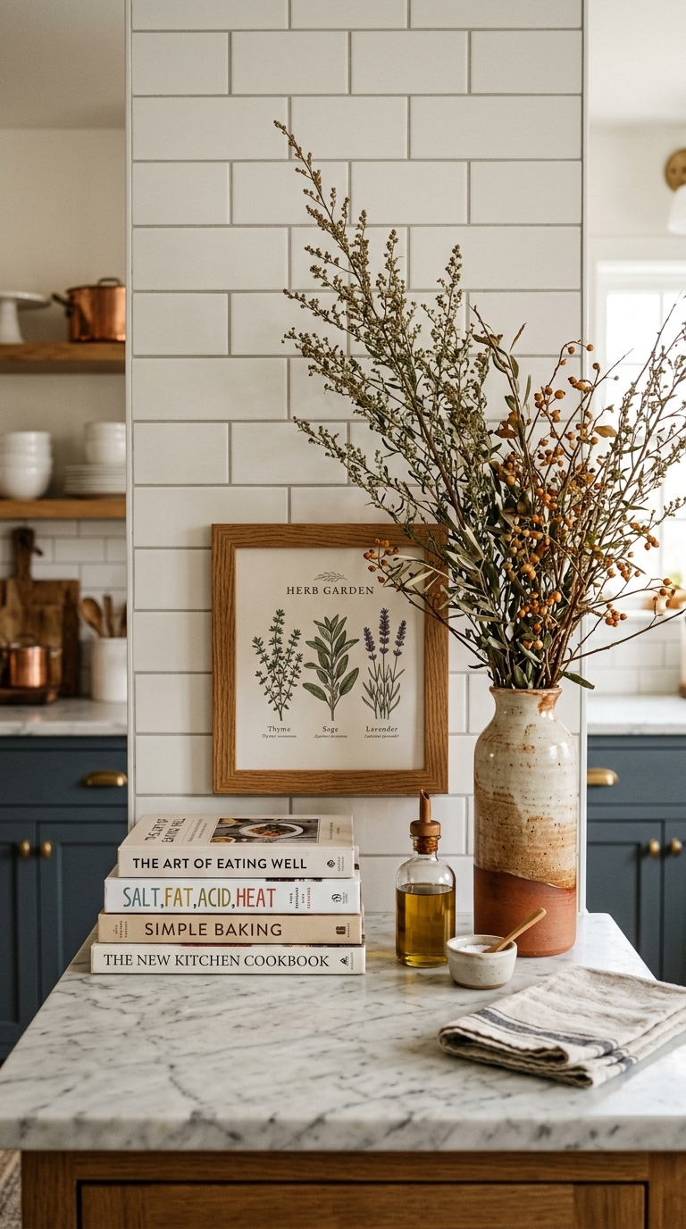
This image adds height with a leaning art print and a tall vase, giving the scene dimension without overcrowding the surface. Vertical layers guide the eye and make a counter feel styled rather than flat