9 Studio Apartment Layouts Mistakes to Avoid Before You Decorate
Ready to style a studio that actually feels like a full home? Studio apartment layout mistakes can make even the cutest decor look cramped or chaotic—this guide calls out the nine most common errors to avoid before you buy, paint, or move in furniture. You’ll get clear, Pinterest-friendly fixes for spacing, storage, lighting, scale, and multiuse furniture so your one-room layout feels intentional and airy. Flip through these smart layout corrections and start decorating with confidence. Read on for the numbered mistakes and simple swaps that upgrade small-space style.
1. Choosing oversized furniture that overwhelms the room
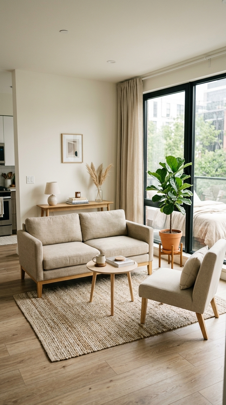
This shot shows a small studio living area where scaled-down furniture—slim sofa, round mini coffee table, and a slim console—creates breathing room and visible walkways. The light-wood legs, linen upholstery, and woven rug keep the palette airy and modern, proving that smaller, proportionate pieces make a studio feel larger and more curated.
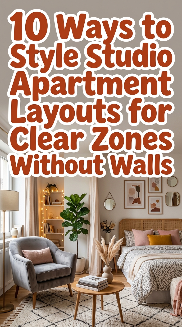
2. Skipping clear zoning so sleeping, living, and working blend together
![]()
The image shows deliberate zoning using an open shelving divider to separate the bed from the living area, plus a window desk for a defined workspace—textures like a knitted throw, linen curtains, and a jute rug visually anchor each zone. Zoning keeps functions distinct while maintaining an open flow, a trick many small-space layouts miss. 8 Studio Apartment Layouts That Make One Room Work Like A Full Home
3. Blocking natural light with heavy window treatments or bulky furniture
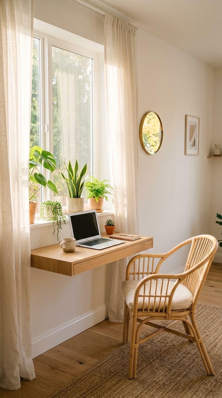
This image highlights the power of unobstructed natural light—sheer curtains, minimal window furniture, and a mirror to bounce sunlight make the whole studio feel larger and fresher. It’s a simple trend-forward swap: replace bulky drapes and large pieces near windows with low-profile options to brighten and visually expand the space.
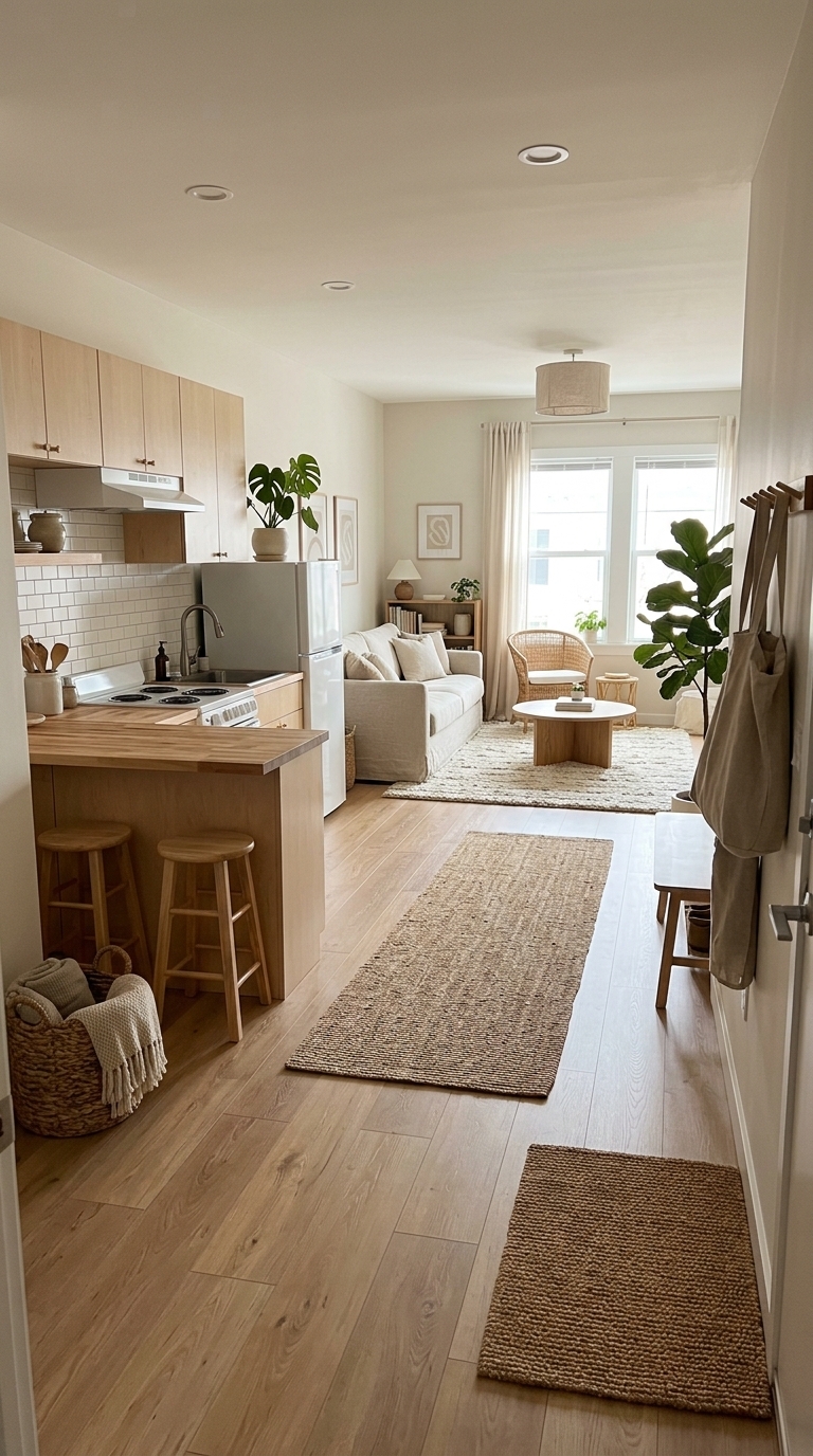
4. Using too many tiny rugs that visually chop the floor
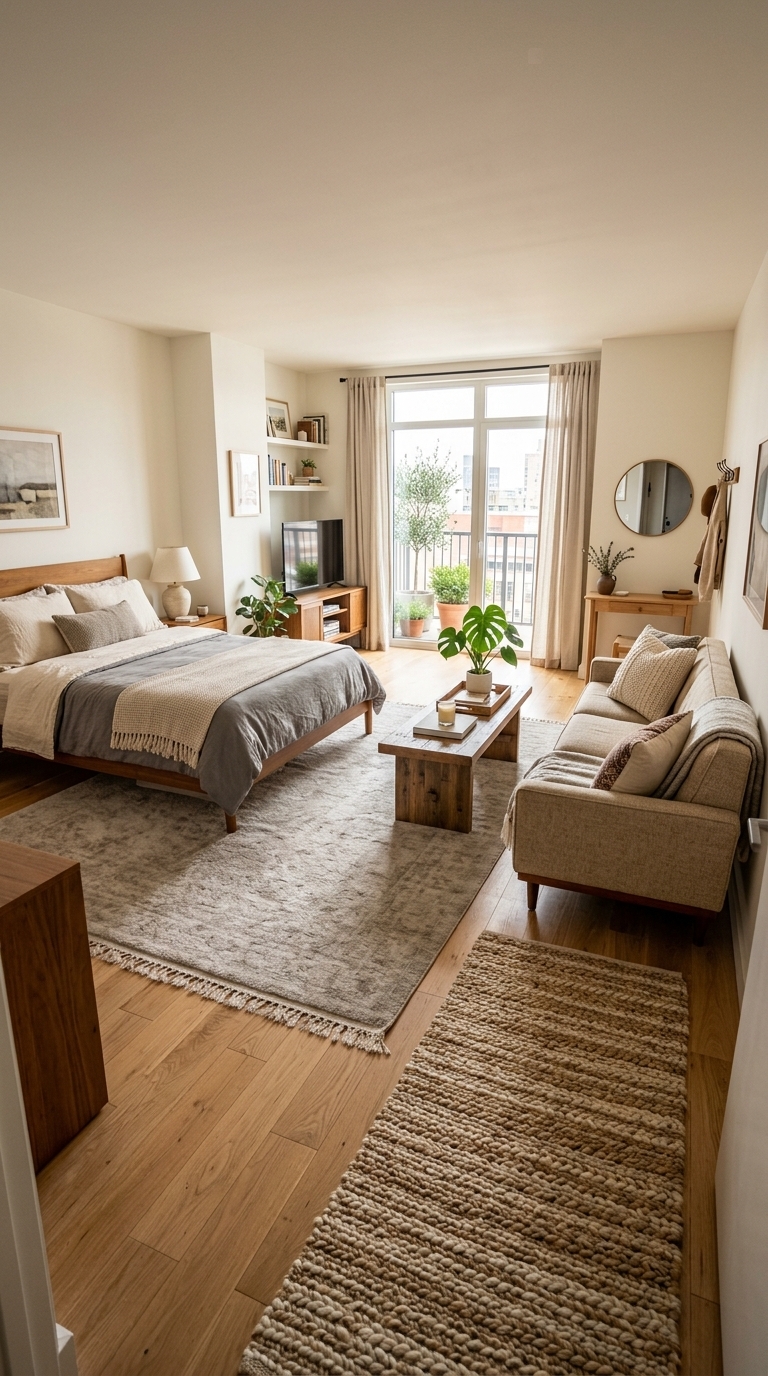
The photo demonstrates how one appropriately sized rug unifies multiple zones—here a larger rug ties the living and sleeping areas together while a runner adds circulation without breaking the floorplane. This approach prevents a chopped, disjointed look and supports an intentional, cozy aesthetic.
6. Overlooking vertical storage and leaving walls empty
![]()
This image highlights smart vertical storage: floating shelves, a tall bookcase, and hooks free up floor space while adding display surfaces. Using height for storage keeps the room tidy and stylish—perfect when floor square footage is limited. 12 Easy Studio Apartment Layouts That Look Polished at Home
7. Relying on overhead lighting alone instead of layered sources
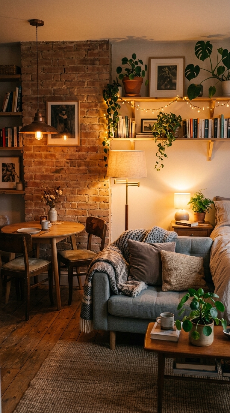
The picture shows layered lighting creating atmosphere and flexible function—task light for reading, pendant for dining ambiance, and string lights for mood. Studios benefit from multiple light sources to define zones and avoid flat, clinical overhead light, making evenings feel warm and intentional.
8. Piling on decor that creates visual clutter instead of a focused edit
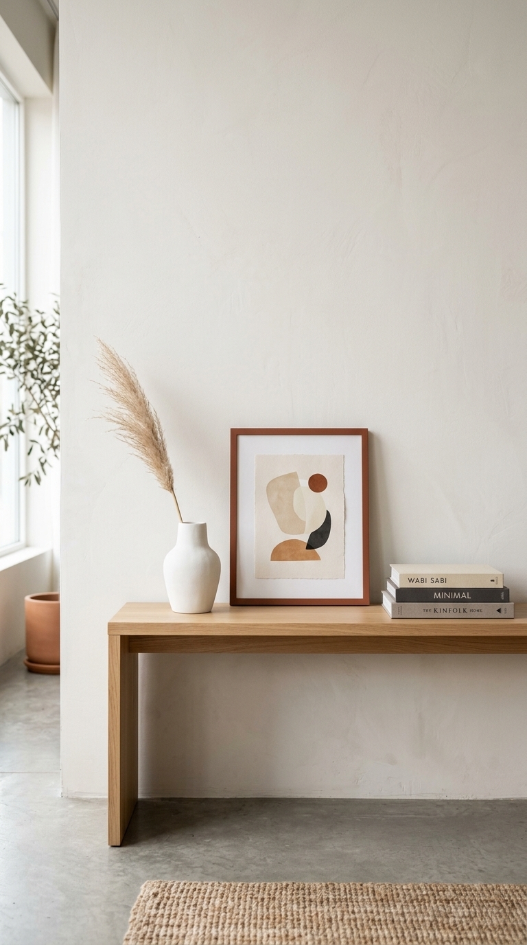
This image proves the ‘less is more’ rule: a few thoughtfully chosen accessories on a console create a calm, editorial look without overwhelming the space. A restrained palette and negative space let each item shine, which helps small rooms feel curated rather than cluttered.
9. Ignoring traffic flow and leaving awkward walkways
This photo shows intentional placement that prioritizes a smooth traffic flow—furniture is arranged to create clear pathways, with rugs and spacing guiding movement. Paying attention to circulation prevents cramped or awkward layouts and makes a studio feel more livable and intentional.