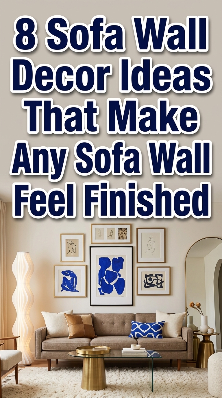
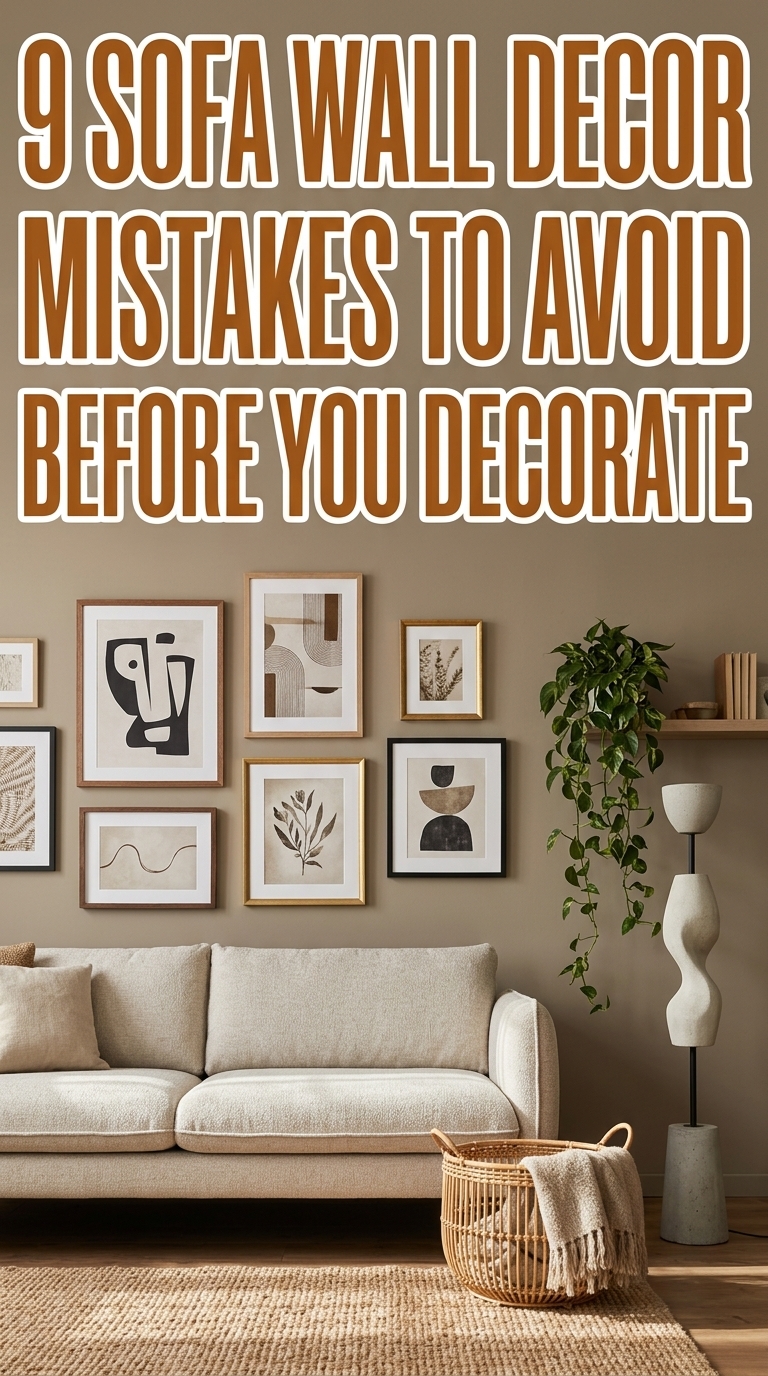
9 Sofa Wall Decor Mistakes to Avoid Before You Decorate
Trying to make your sofa wall feel intentional but worried you’ll mess it up? 9 Sofa Wall Decor Mistakes to Avoid Before You Decorate cuts through the guesswork so your living room refresh looks polished, balanced, and Pinterest-ready. From scale snafus to layout flops and color clashes, this list highlights the pitfalls that make a curated wall read amateur instead of edited. Read on for smart, style-forward fixes you can try tonight to lift your whole room.
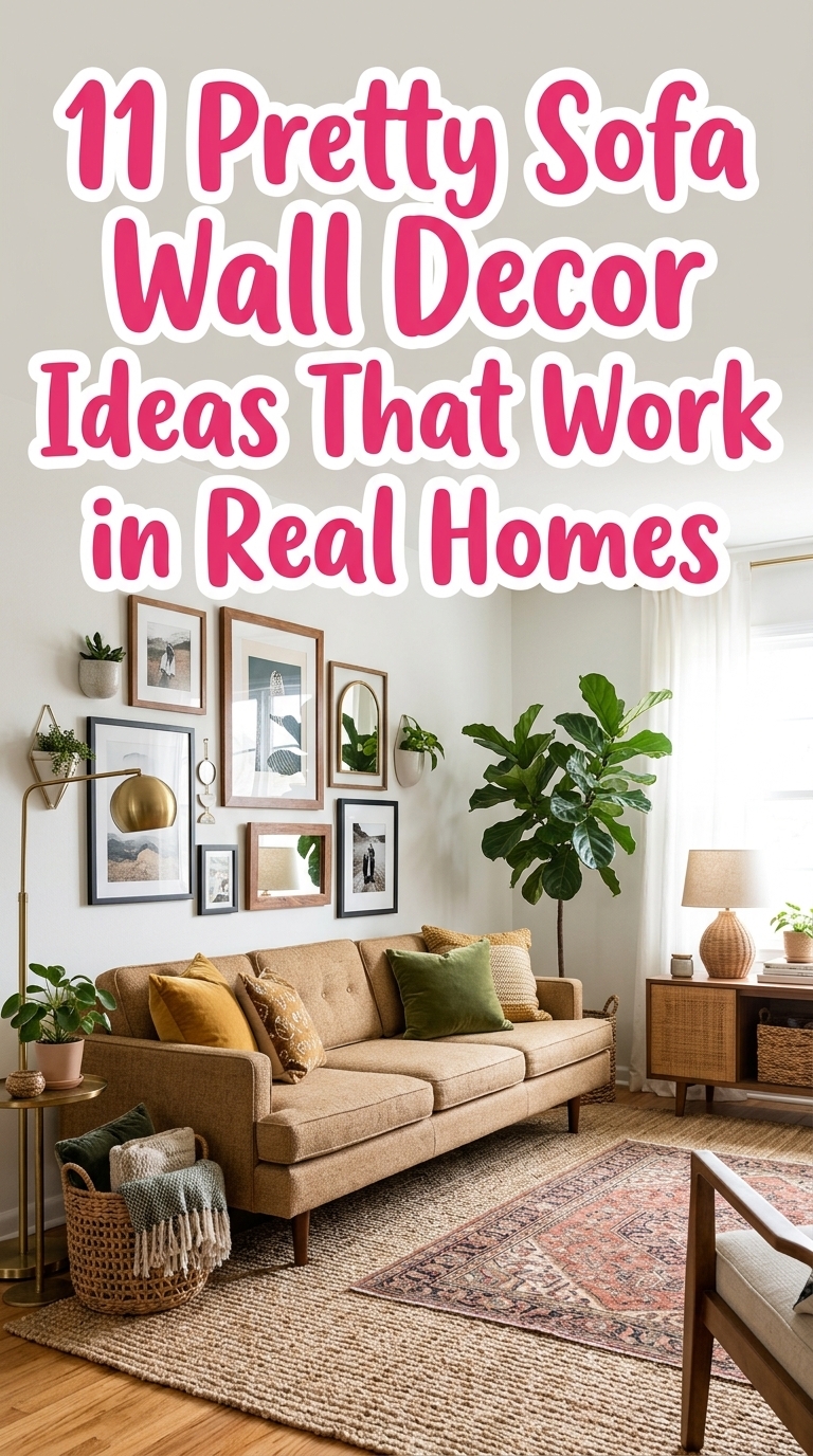
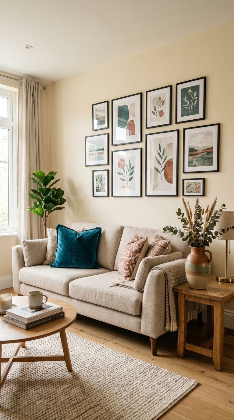
3. Edit your gallery — avoid overcrowded, chaotic groupings
This image highlights a tidy, edited gallery where spacing and a restrained palette prevent the wall from feeling cluttered. Keeping frames similar in tone and leaving breathing room lets each piece matter — perfect for anyone who wants a collected look without the overwhelm.
4. Coordinate frames and colors — ditch the mismatched look
Here the consistent black frame finish and white mats make a varied set of artwork read as a single, intentional collection. The cream wall and jewel-toned cushion add contrast while keeping the styling elevated — an easy trick to stop clashing metals and chaotic finishes from undermining your design.
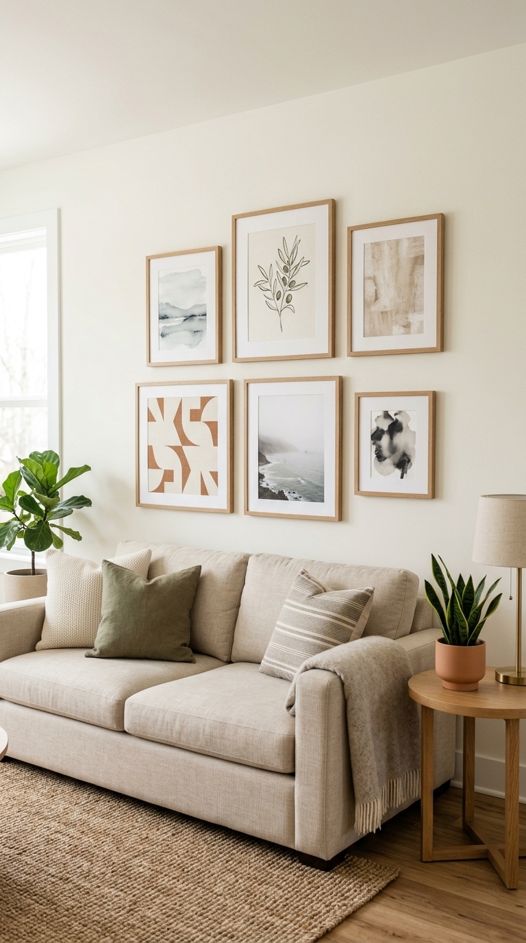
5. Anchor with the sofa — size art to furniture, not the whole wall
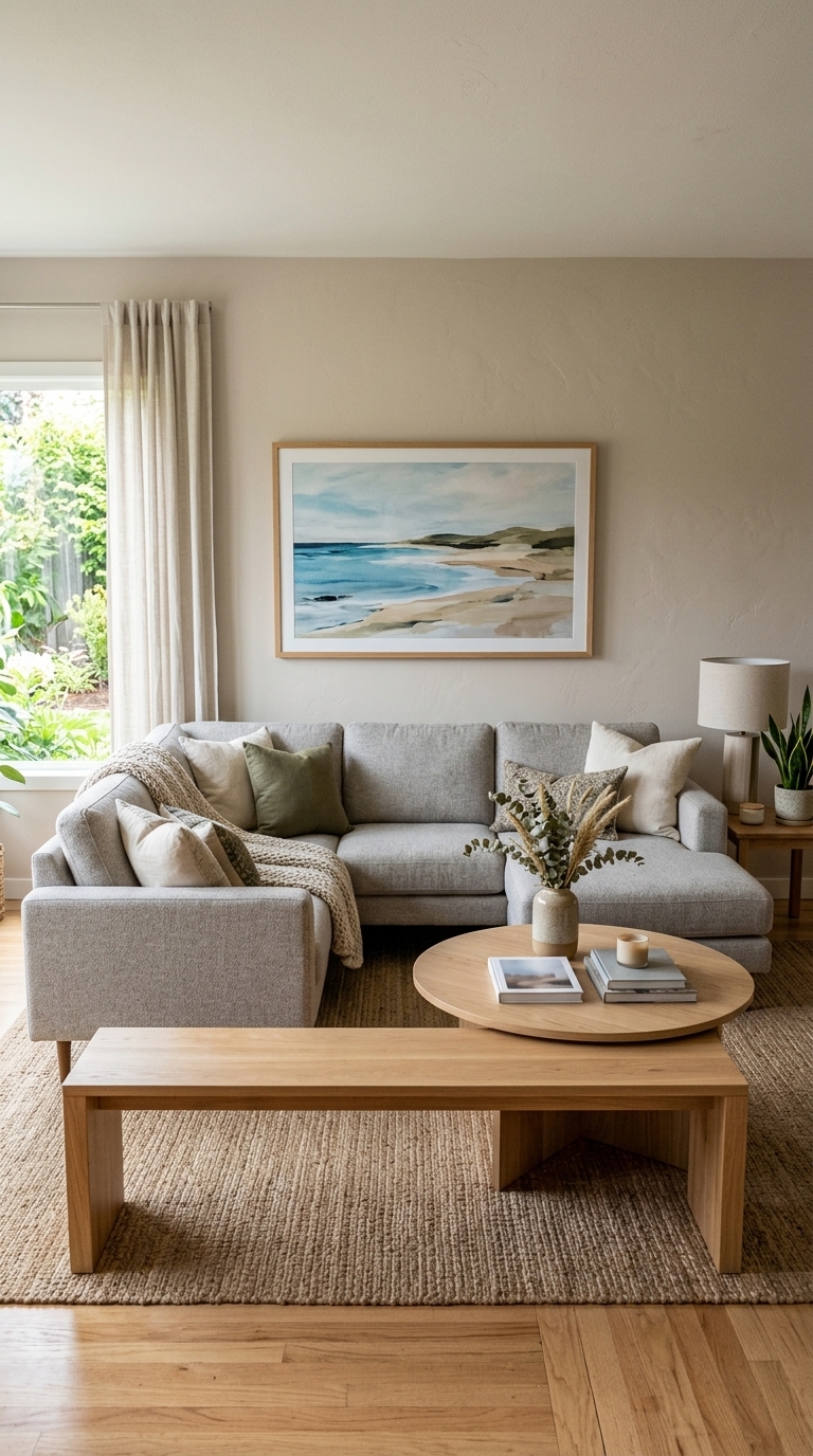
This photo shows artwork sized to the furniture rather than the entire wall, which visually anchors the seating area and feels proportionate even in rooms with high ceilings. Use this approach if you want a balanced, cozy seating vignette rather than tiny art floating in a sea of wall.
6. Layer for depth — add lighting and mirrors so walls don’t feel flat
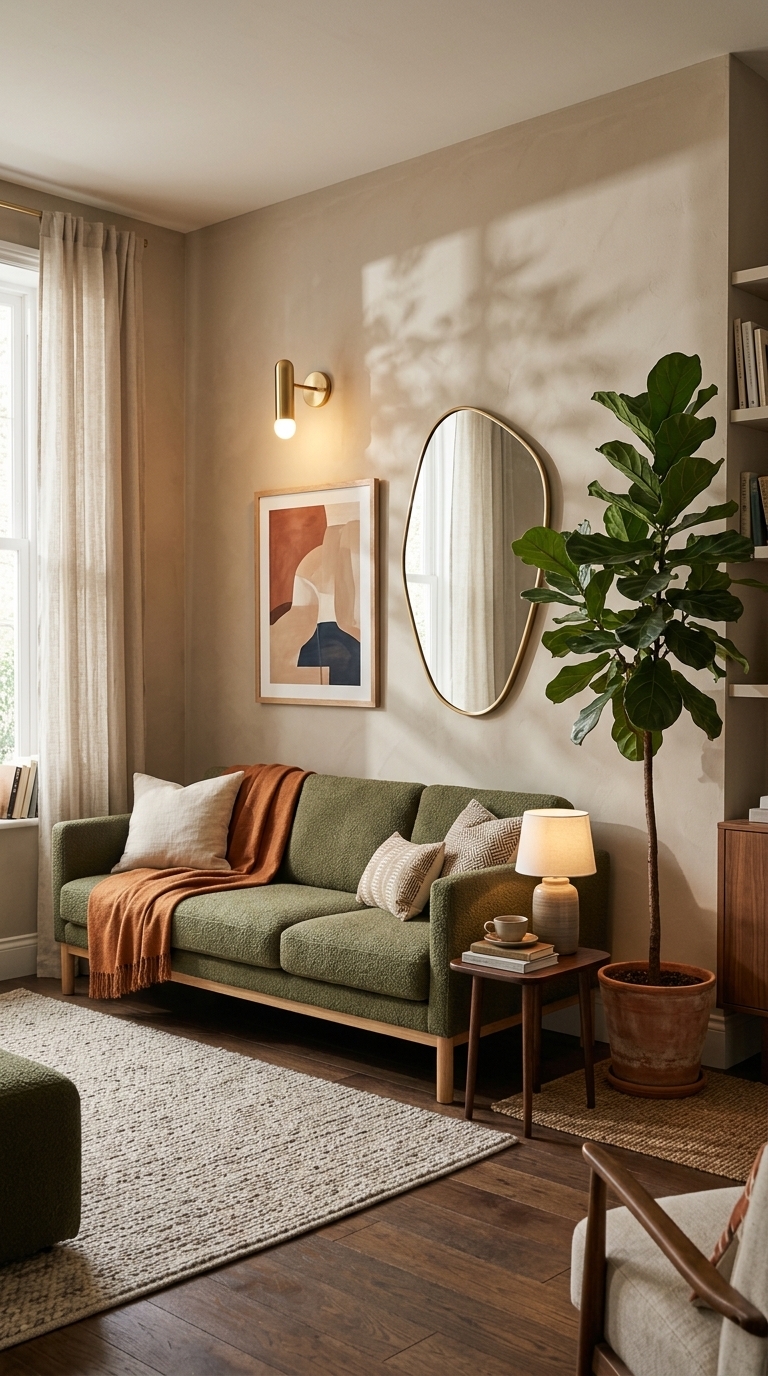
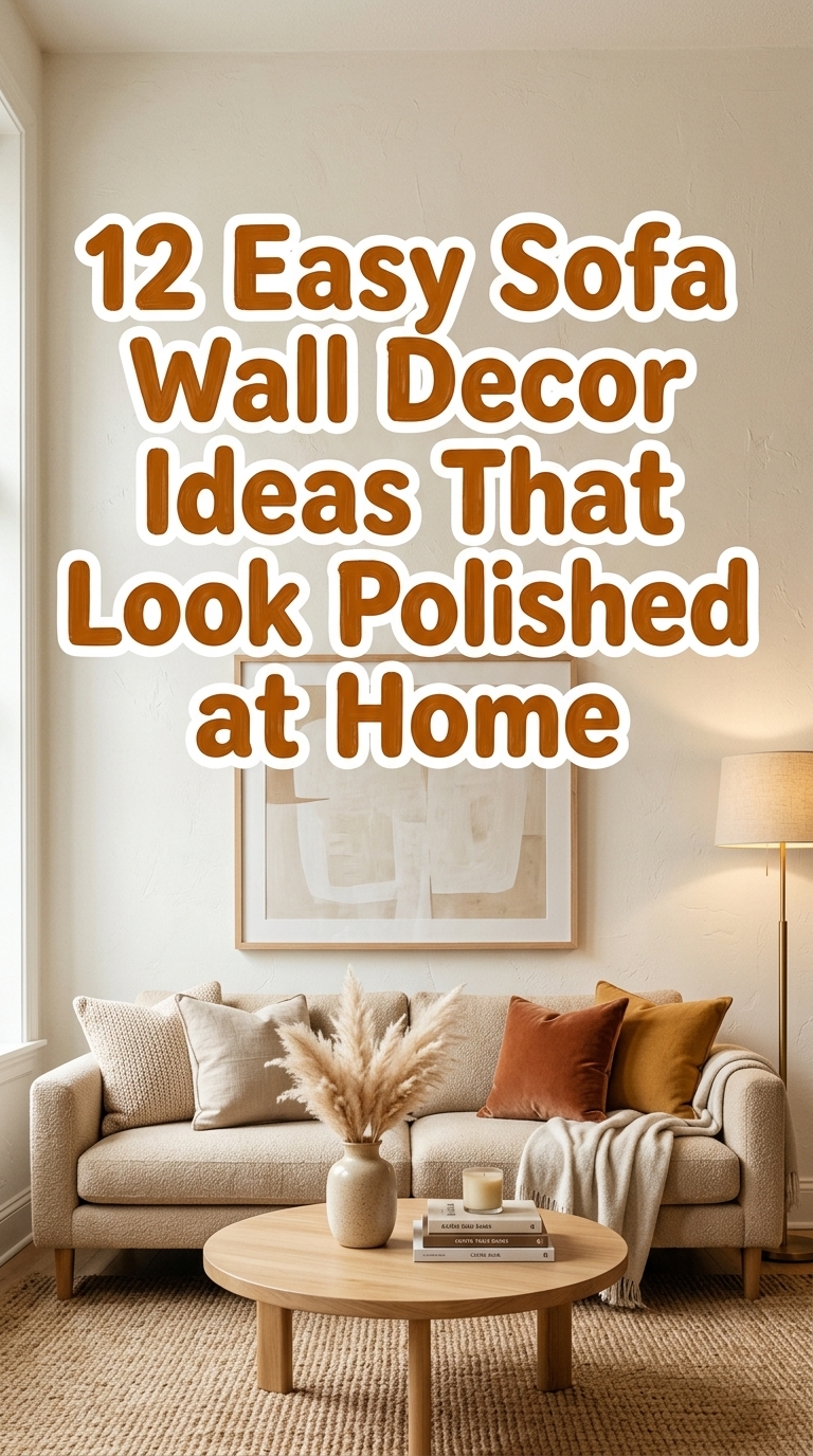
This scene layers reflective surfaces and directional light to give the wall dimensionality, so decor feels dynamic instead of flat. A mirror plus a wall sconce and a green plant create rhythm and brightness — great for small or dim rooms where art alone won’t provide depth. 12 Easy Sofa Wall Decor Ideas That Look Polished at Home
7. Choose one hero piece — avoid competing statement pieces
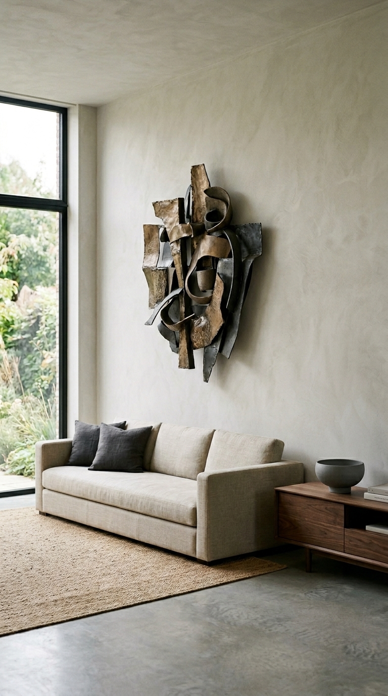
The image shows a single dramatic artwork acting as the hero, with pared-back furnishings that let it breathe. Picking one statement piece helps your room feel edited and editorial — ideal for renters or anyone who prefers a calm, gallery-like vibe.
8. Respect negative space — let breathing room make your art shine
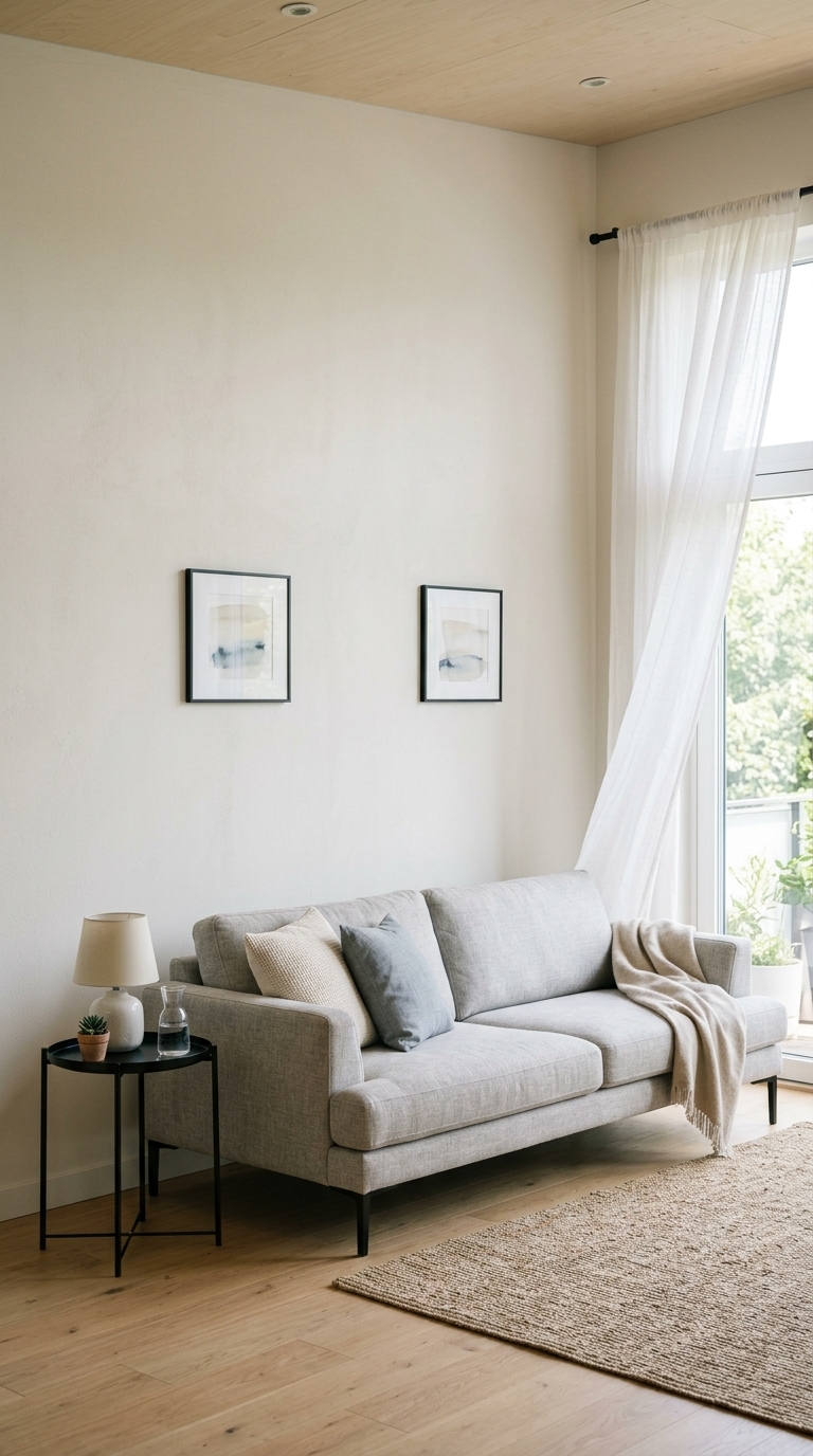
This styling uses generous negative space to highlight each artwork and the sofa rather than trying to fill every inch. The airy curtains and minimal side table keep the look light and contemporary — a helpful reminder that empty space can feel intentional and luxurious.
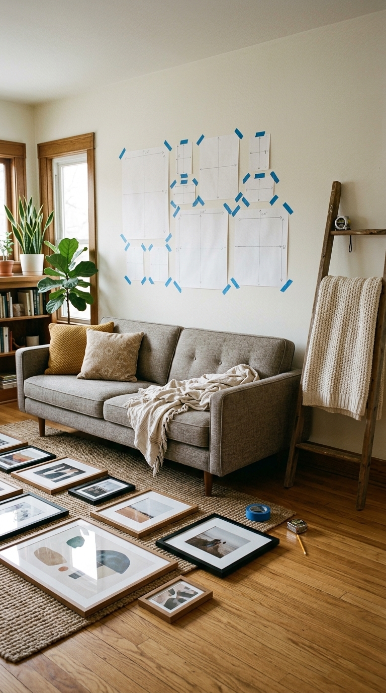
9. Mock it first — try layouts before committing to holes
The photo shows a practical pre-hang setup: frames on the floor and paper cutouts on the wall so you can experiment with layout and scale without drilling. Taking this small extra step prevents awkward mistakes and helps you find the perfect composition for your sofa wall.